Fifty Services, One Voice
University of Arizona Libraries
2025 · Web Design, Content Strategy
From 2021-2025, as the designer and product owner of the University of Arizona Libraries website, I led the Web Refresh project that revamped the library’s online presence.
Problem: too many websites
As of 2021, The University of Arizona Libraries system directly operated four locations:
- Main Library
- Weaver Science-Engineering Library
- Special Collections
- Health Sciences Library
These libraries lacked a single online presence. Among the various public-facing websites they operated, the first two libraries shared the same website, while the third and fourth each had a separate website. In addition, Data Cooperative, a data support services group within the library, also operates its own website.
Each website lived on a different content management system and had inconsistent branding, design, and content strategy. This created a gap when the user searches for library resources, as they often had to switch between websites. Also, the site search on one site couldn’t index content everywhere, causing findability issues.


In 2021, the library leadership sponsored the Web Refresh project, one that aims to create a unified online presence for all libraries. As a core member of the project, I led a collaboration between the libraries’ User Experience (my team), Development, Project & Portfolio Management, and Marketing & Communications teams, along with stakeholders from other departments.
Begin with a design system
In 2021, a group of designers, developers, and project managers in the University of Arizona community collaborated on Arizona Quickstart, a centrally-maintained, Drupal-based content management system that seamlessly integrates the university’s brand and web component library.
As part of the group, I contributed to the design of Arizona Quickstart’s component library, which is based on Bootstrap, and translated most elements into a design system in Figma.
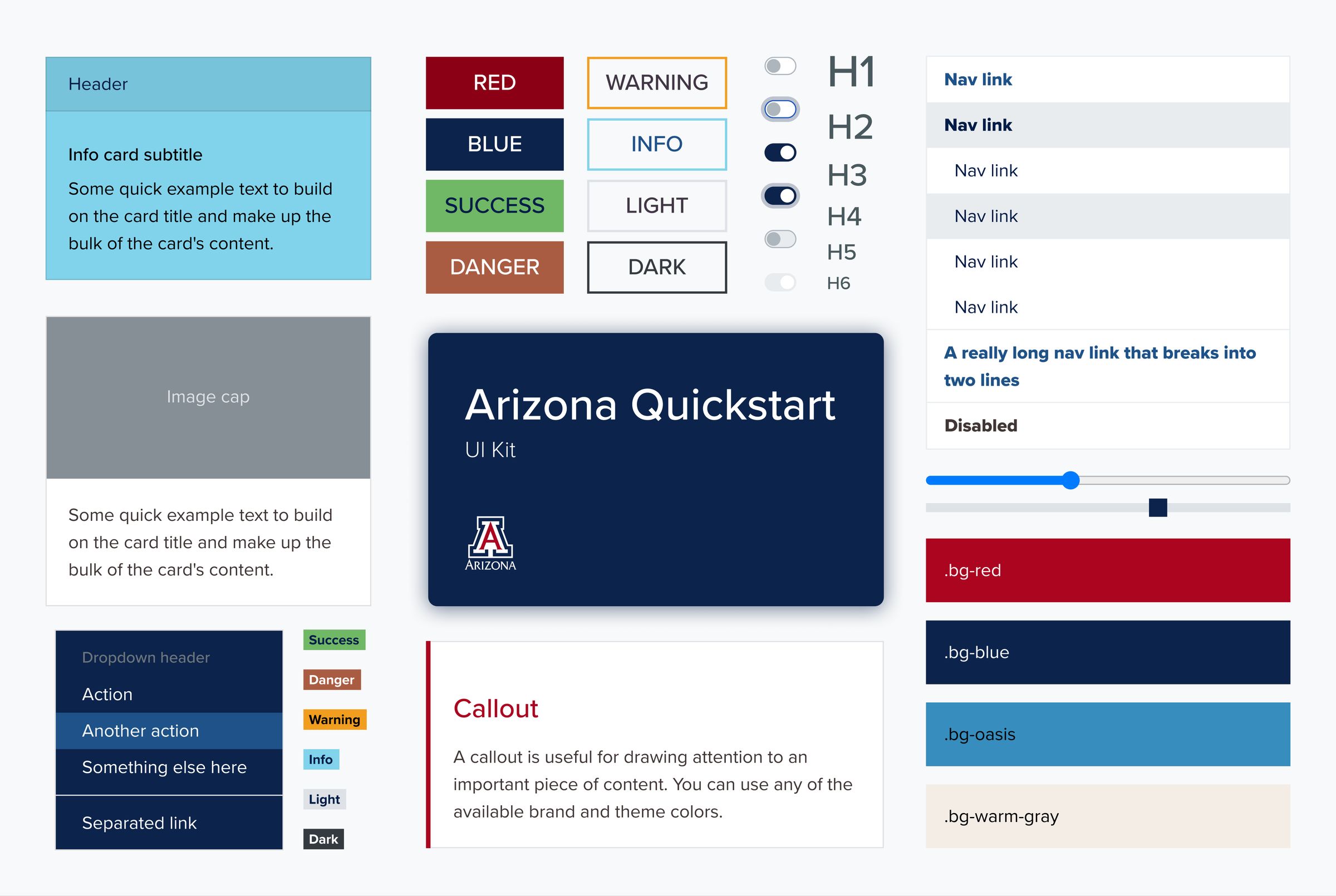
Before Web Refresh, due to the fragmentation, the Libraries independently maintained several custom-developed Drupal instances for the public-facing websites. The project team saw the potential of the new campus-wide content management system and decided to build a unified website on this new platform.
Engage stakeholders through interviews and workshops
Throughout the project, I designed, organized, and led or co-led:
- 8 rounds/18 sessions of stakeholder interviews
- 8 design workshops
- 10 other UX workshops, including card sorting, journey mapping, and content planning
In total, 47 stakeholders from all eight library departments participated in the stakeholder interviews and design workshops.
The stakeholder interviews aim to understand the needs, requirements, and pain points of the departments involved in the project. They also serve as a channel to introduce the project’s background and communicate the timeline and proposed technical changes.
The design workshops utilized various design thinking, prototyping, and content strategy methods to effectively create consensus between implementors and stakeholders.
The next four sections will break down some of the methods used in these workshops.
Visualize the user journey
One of the project’s goals is to move multiple websites under one umbrella called the “multi-site.” To get there, the project team wanted to understand how users navigate within an individual element, a “sub-site,” and between these sub-sites. Some common website modules that are shared among sub-sites were also considered as part of the user journey—for example, the library hours and room reservation modules.
For each product , the team identified a group of stakeholders who ran a service, managed a team, or interacted with patrons directly. I led a journey mapping activity with 3 stakeholder groups. Each activity was uniquely crafted for the service, while all of them shared some common prompts that include:
- how the user interacted with the service in the past
- how stakeholders want the service operated in the future
- how the user will find the service on the multi-site
- what the gaps are

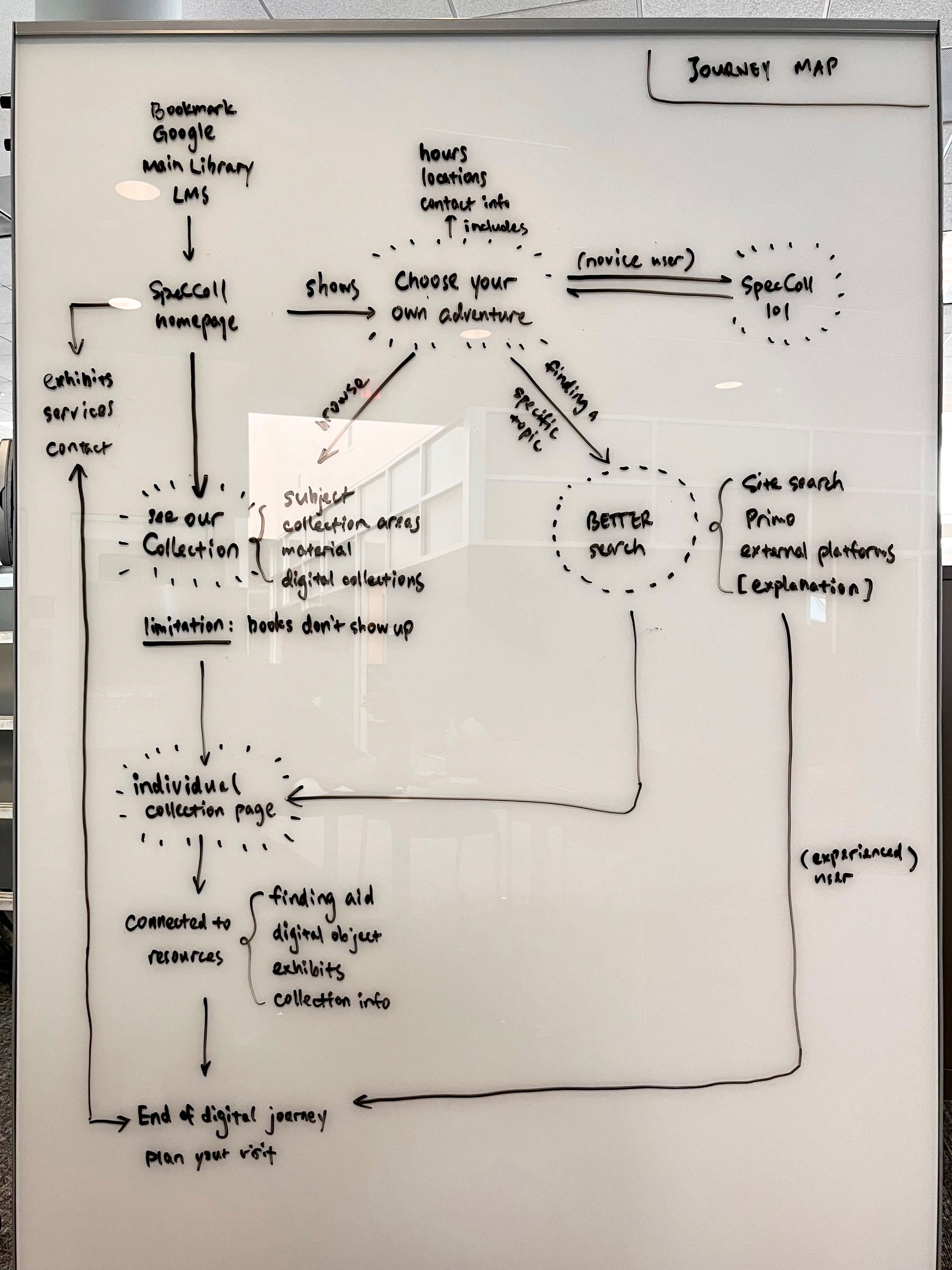
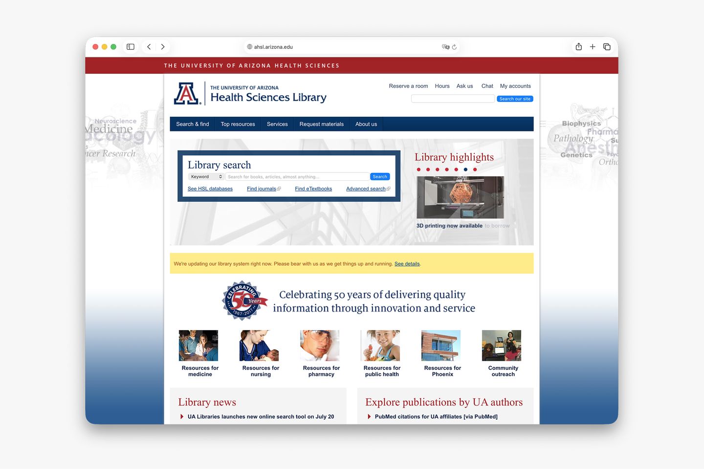
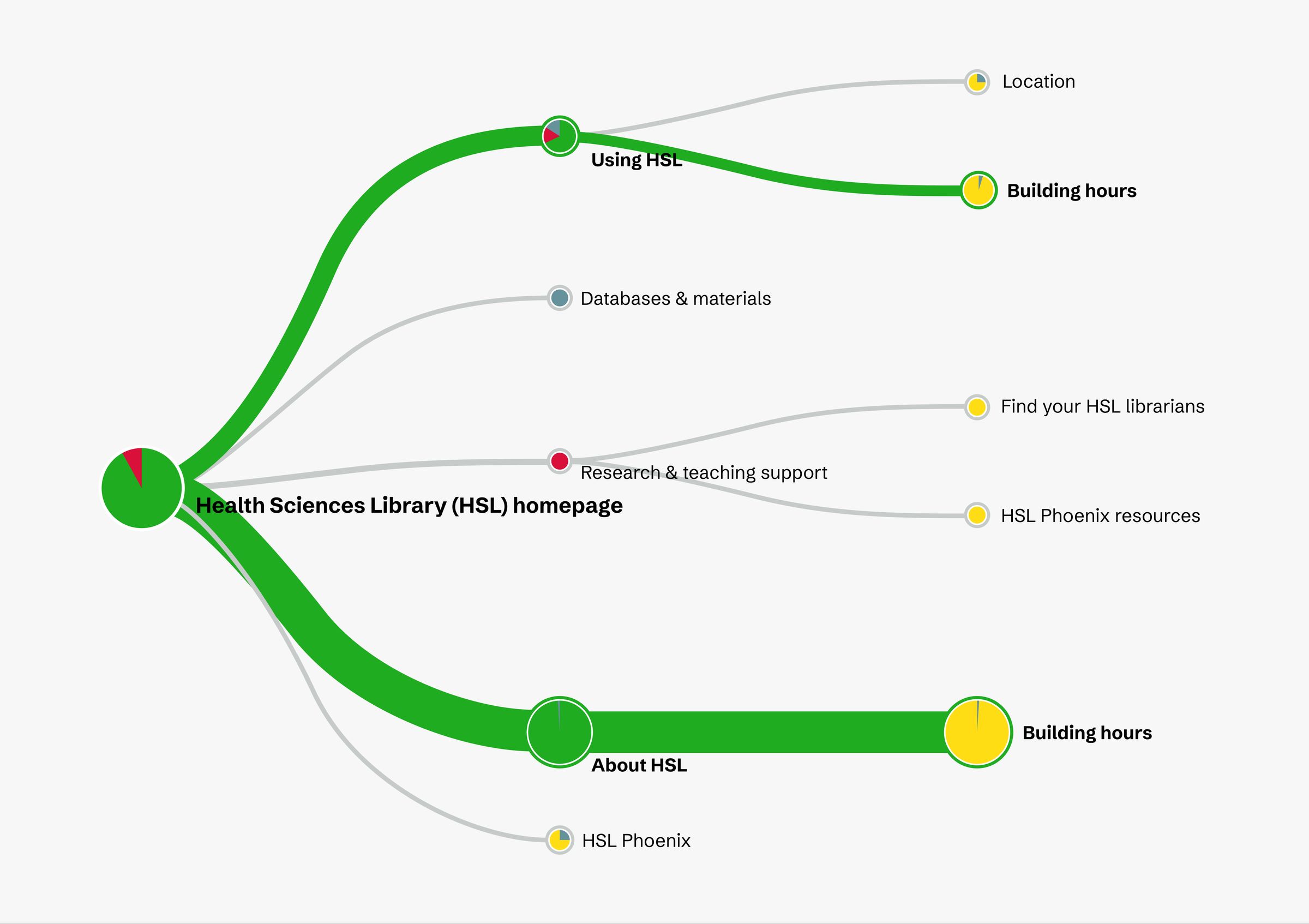
As an example, the Health Sciences Library website was chosen as the pilot for the sub-site on a multi-site structure, even though it had always existed as a standalone site on a separate domain. Therefore, the journey mapping activity with the Health Sciences Library’s stakeholder group focused on analyzing:
- who the main audiences of the website are
- how the online traffic moves from and to the other library websites
- which services or resources are unique to the Health Sciences library, and which are shared with other libraries
In the activity, a consensus was reached that the sub-site requires a secondary navigation pattern to differentiate content that’s specific to the sub-site. This decision was subsequently implemented as an information architecture strategy for other sub-sites.
Create information architecture from the user’s angle
The library has a sea of resources and services—and as the product owner of the library website, my vision is for it to provide the user with just the right amount of information so they can quickly reach what they need. With the majority of website content woven into layers of menus, thoughtful information architecture design builds a solid foundation for the website.
A common mistake when designing information architecture for a large organization is to create website menus that mirror the org chart, and we weren’t an exception. Each team owned a section on the website simply because it was easy to manage website content that way. However, this approach often confuses the user because they don’t know (and don’t need to know) which department owns a service or resource.
To ensure easy discovery of information on the redesigned website, our team designed the website information architecture from the user’s angle.
I partnered with the Content Strategist to create cards that include existing and future topics that are relevant to a specific service, then led card sorting workshops joined by individual groups of service and product owners. We invited the participants to represent their user, not their department, and organize content based on how the user interacts with their service.
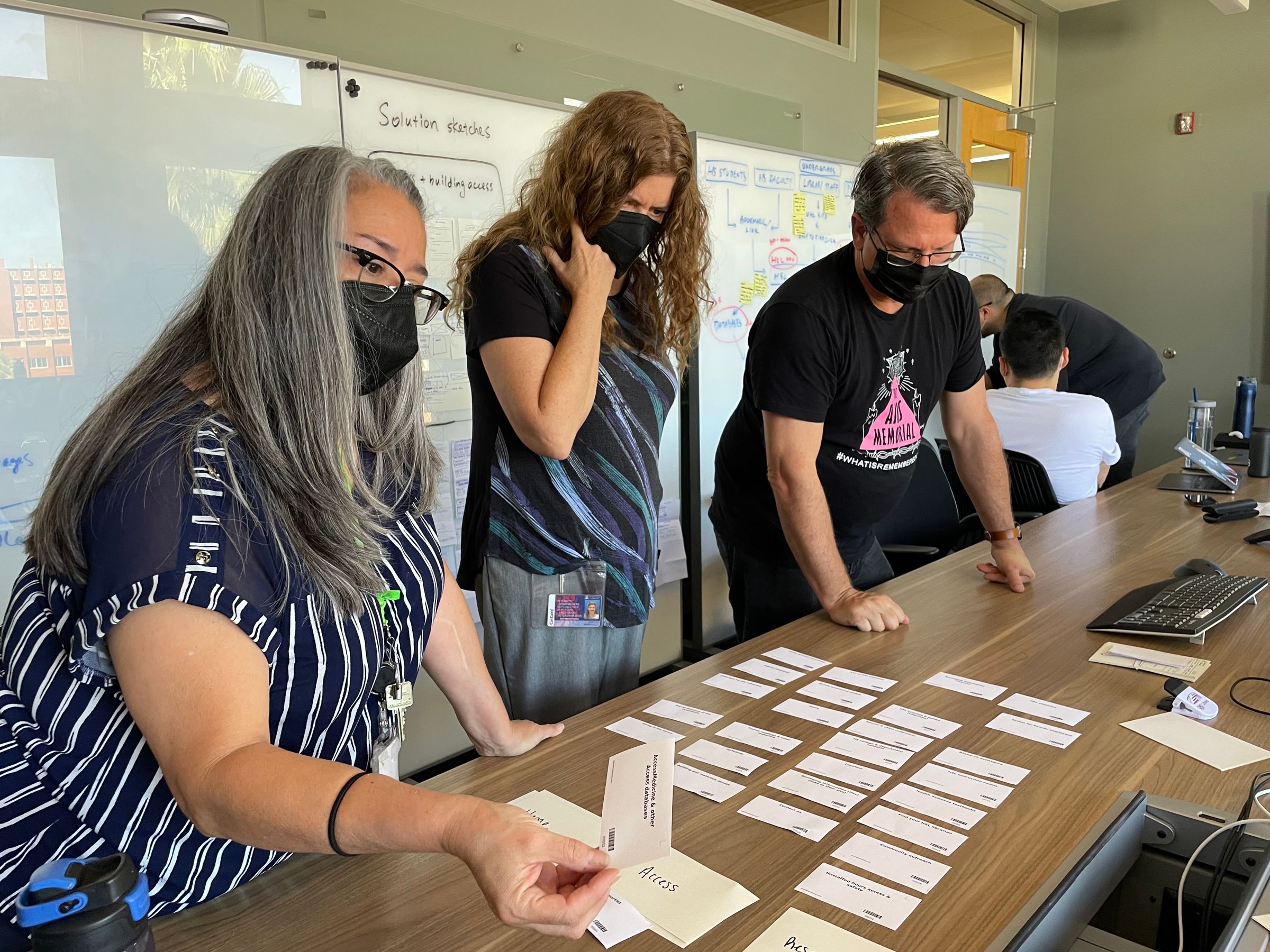
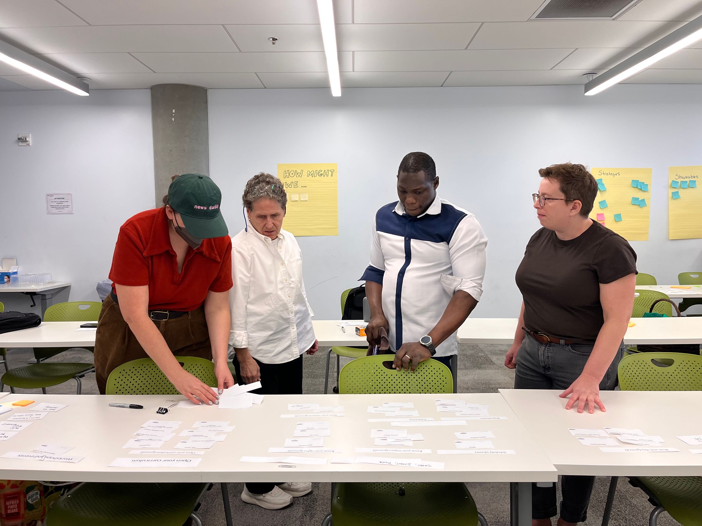
For each service, we then analyzed the card sort results and created a draft menu in Optimal Workshop’s Treejack tool. Then, we invited the university’s students, faculty, and staff to participate in tree tests to validate our information architecture design.
In each tree test, the participant was asked to complete tasks relevant to a service or product in a website menu. The menu they saw includes just the page titles and no other context. The Treejack tool recorded and visualized the path each participant took, time on task, and whether they reached the correct destination. We then iterated on the menu design based on the tree test results.

Design the user interface with stakeholders and developers
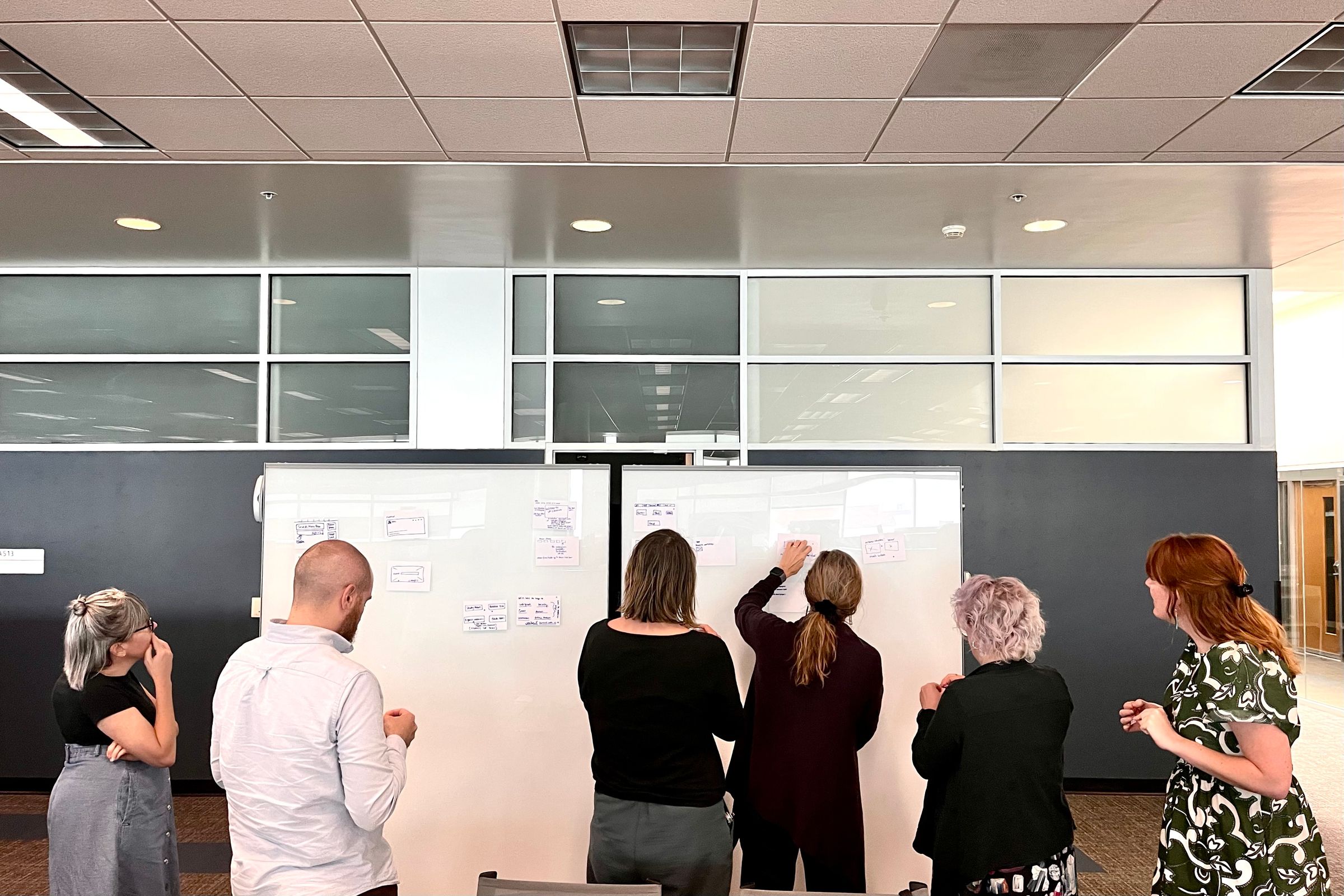
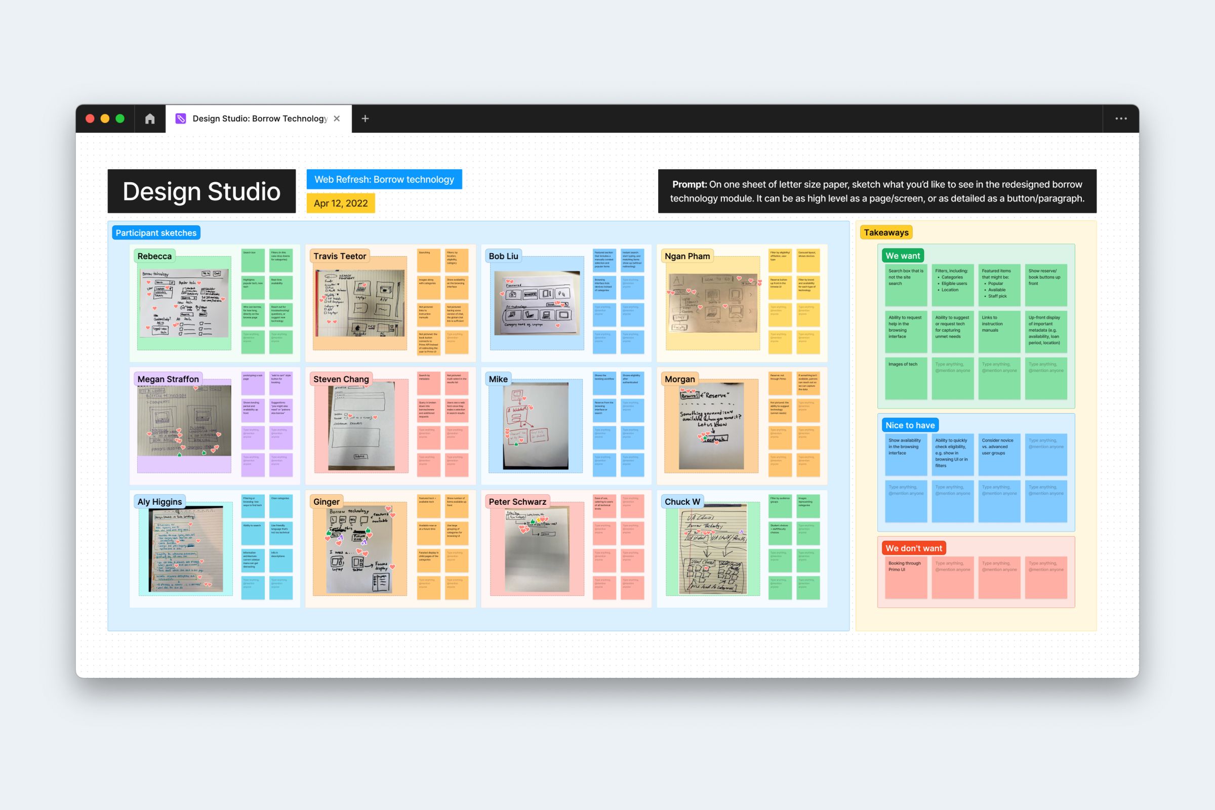
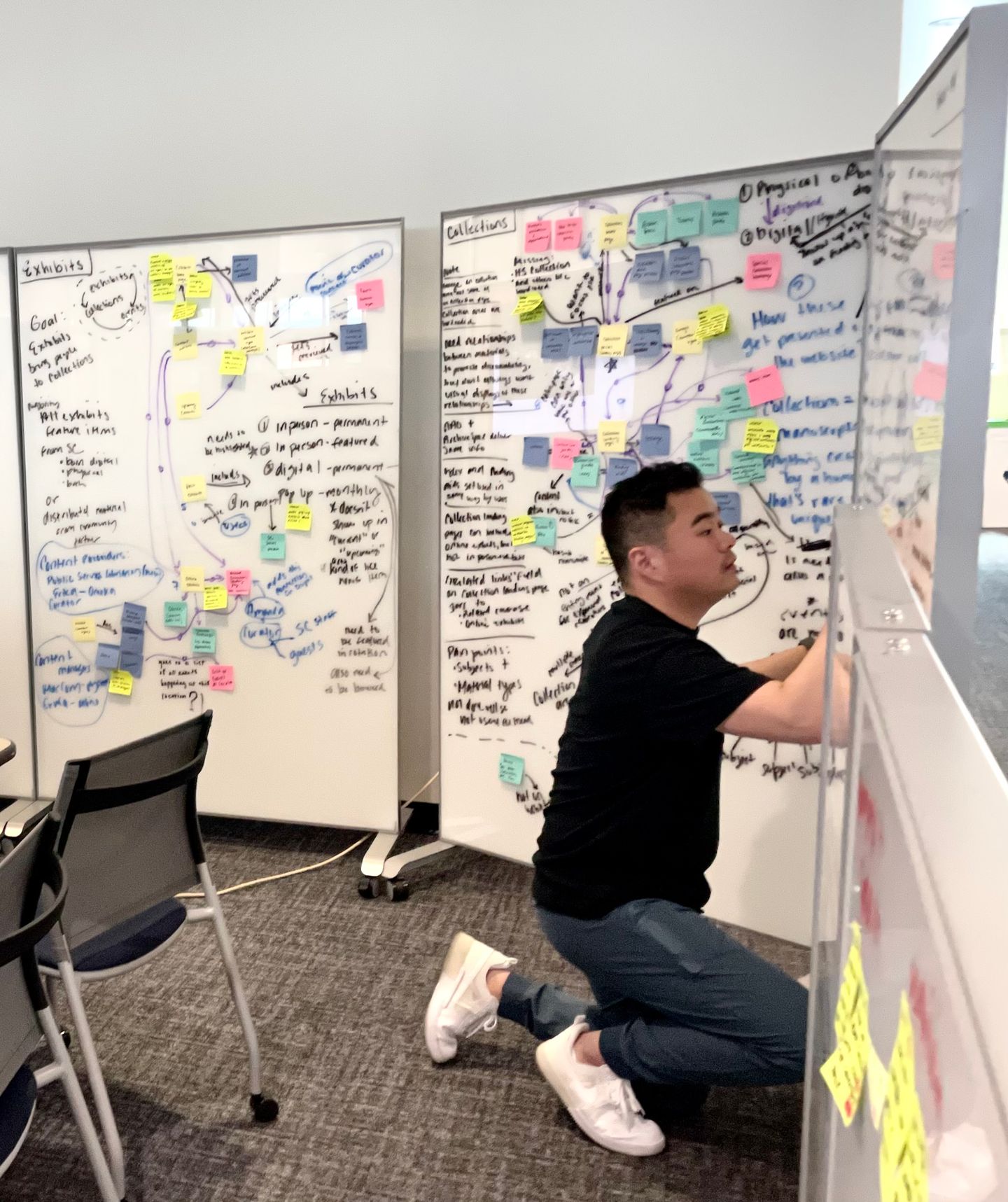
I like to mindfully include stakeholders and other contributors early in the design process. I often use an approach that I call design studio, an interactive workshop where project stakeholders and implementors join the design process.
Sketching is the core of each design studio session. Each participant is asked to use a Sharpie and no more than 3 index cards to sketch the feature they’d like to see in the future product. The goal is not to create pixel-perfect designs, which the setup intentionally discourages, but to convey the concept. All sketches are then taped to a whiteboard and reviewed by all participants. Everyone votes on their favorite design, then the group ends with a moderated design critique.

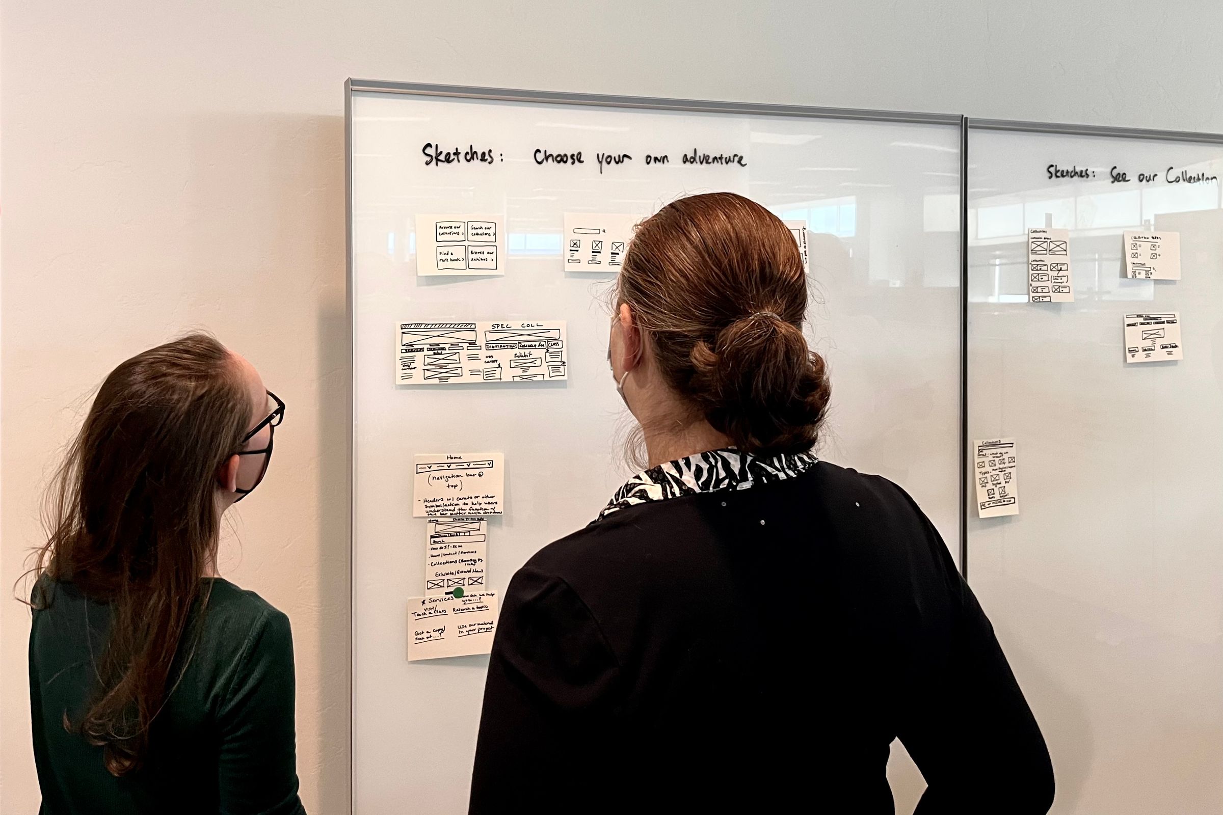
Throughout the Web Refresh project, the team ran 8 design studio sessions (7 in-person and 1 online via FigJam) for 7 products, including sub-sites and common modules. Service and product owners, subject matter experts, developers, and members of the leadership joined the workshops led by members of the UX team.
For me as a designer, sketches created during the design studio sessions serve as a wishlist from each participant without being too limiting. With the analysis from the design critique, I can easily find the common ground and decide the priority.
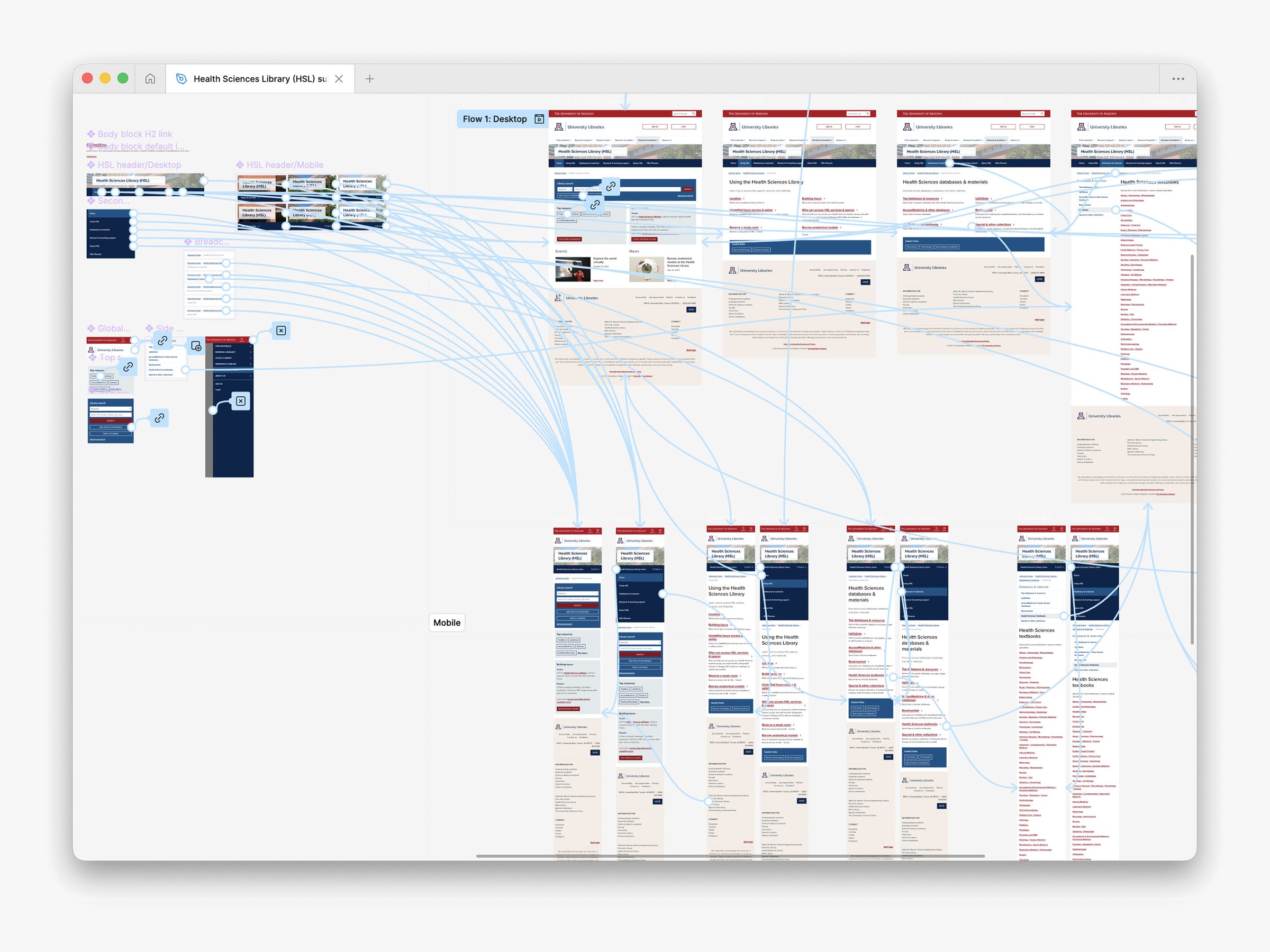
For each product in Web Refresh, I first created low-fidelity prototypes based on sketches from the design studio, then assembled high-fidelity mockups using components and patterns within the design system. The team then used the mockups for stakeholder feedback and usability testing.
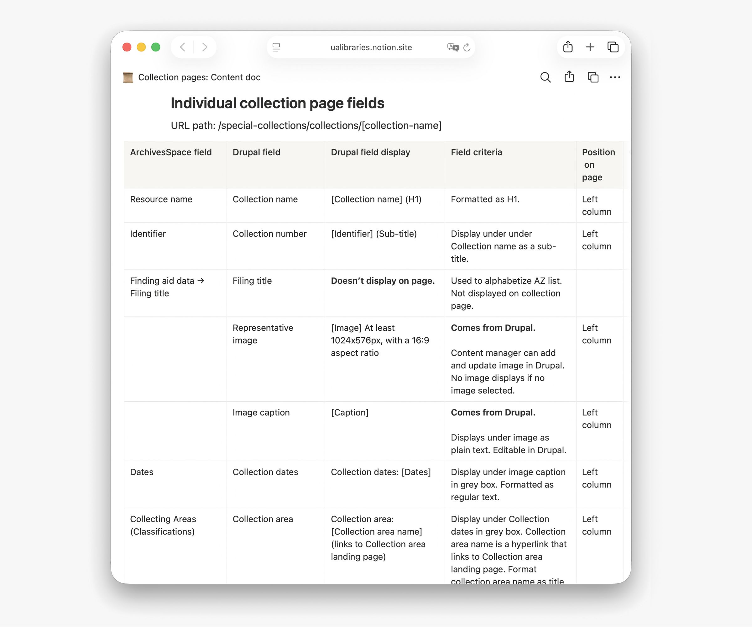
When designing page templates for the content management system, such as a collection in the Special Collections catalog, I worked with the Content Strategist to pair the design prototypes with content docs, which are spreadsheets that map elements in a design prototype to the relevant data in the technical setup, such as a text field in the content management system. The content docs served as an accurate reference for developers when they customized the content management system.

Strategize the content
Consolidating 4 websites into one means a lot of content needs to be migrated, either redesigned or as-is. In partnership with the Content Strategist, I co-led several content planning workshops with relevant stakeholder groups where content was prepared for migration. We focused on reviewing content quality and identify where addition, editing, or removal is needed. Combing through the content also helped stakeholders and project implementors visualize the user journey on the website.
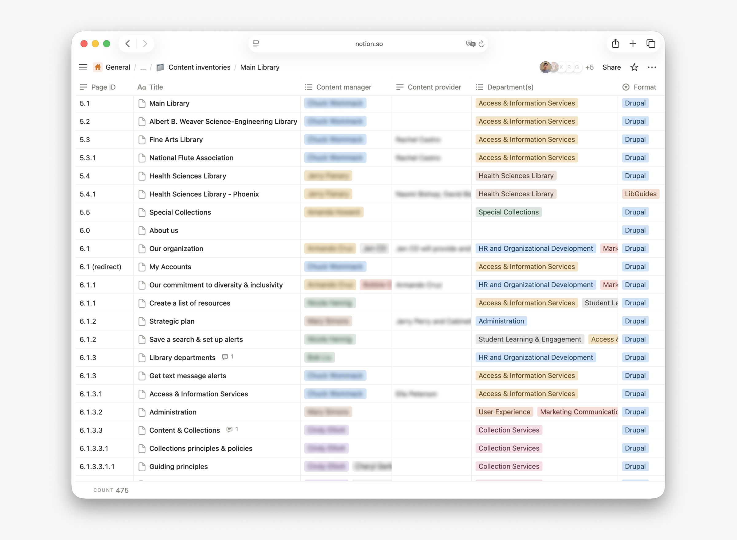
Prior to the content migration, our team established a content inventory for all sub-sites. For each page in the content inventory, we document the following information:
- Page ID, title, and path
- Content ownership
- Platform or format
- Migration status
- Outstanding issues
After the migration, we sustained the content inventory to ensure content on the refreshed website is always up-to-date. We also developed a search engine optimization (SEO) workflow that creates and records page meta descriptions with AI tools.
Test, “a-ha!”, iterate
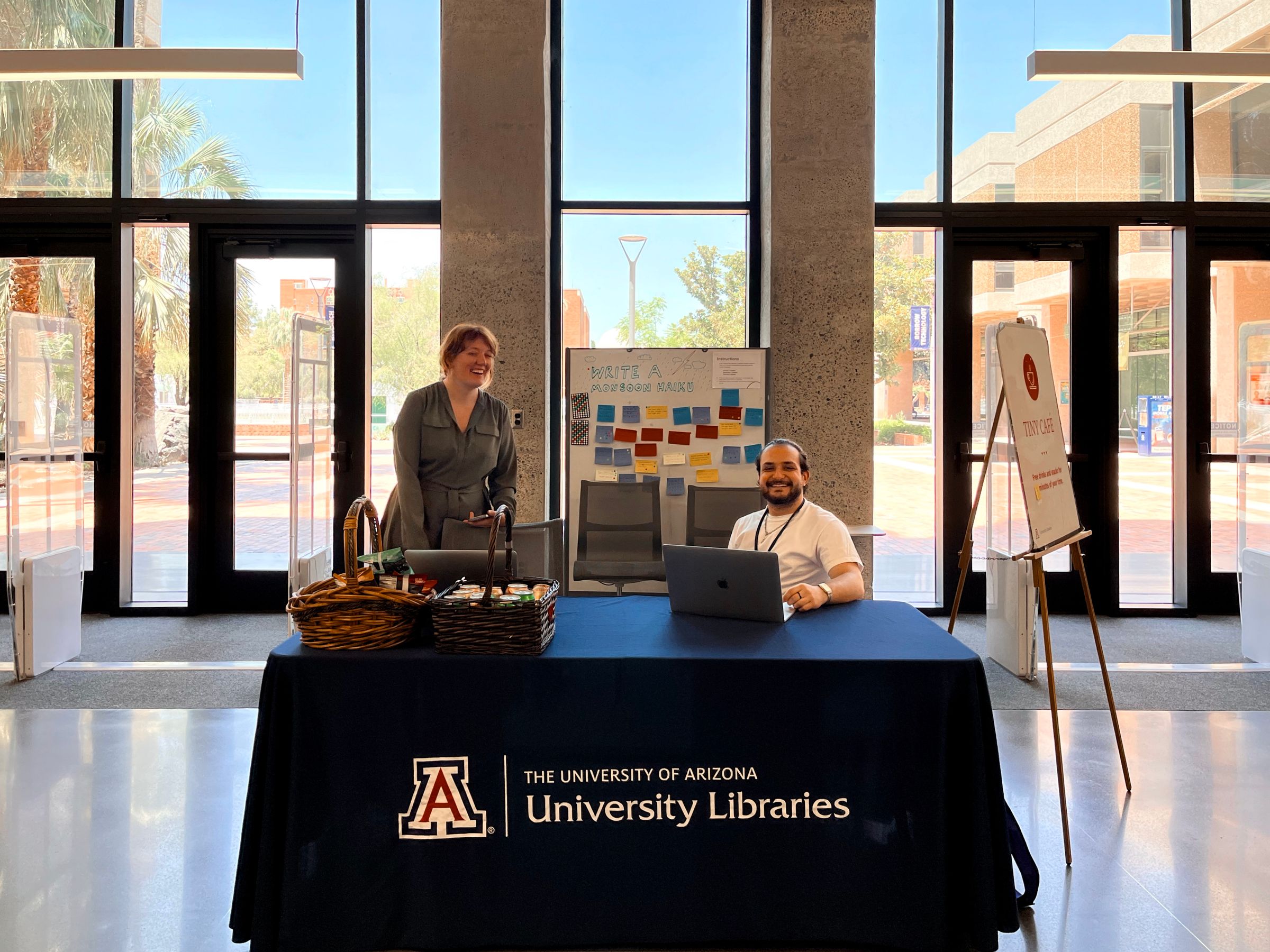
Throughout the Web Refresh project, I collaborated the UX Researcher, Content Strategist, and student assistants on my team to design and conduct more than 50 user research studies, including user interviews, usability testing, and talk-back boards. The user was part of the design process from the beginning to the end.
During the project’s planning phase in April 2021, most libraries were still on a full shutdown due to the pandemic. To find research participants for the project, with the help from faculty members and librarians, I recruited students from several colleges on campus to join an online UX Participant Pool, which is an email list that includes people who voluntarily signed up to receive invitations to UX studies.
As of December 2025, my team still maintains the participant pool that includes 775 students, faculty, and staff affiliated with the University of Arizona. It continues to be an invaluable resource for improving the library’s physical and digital user experience.
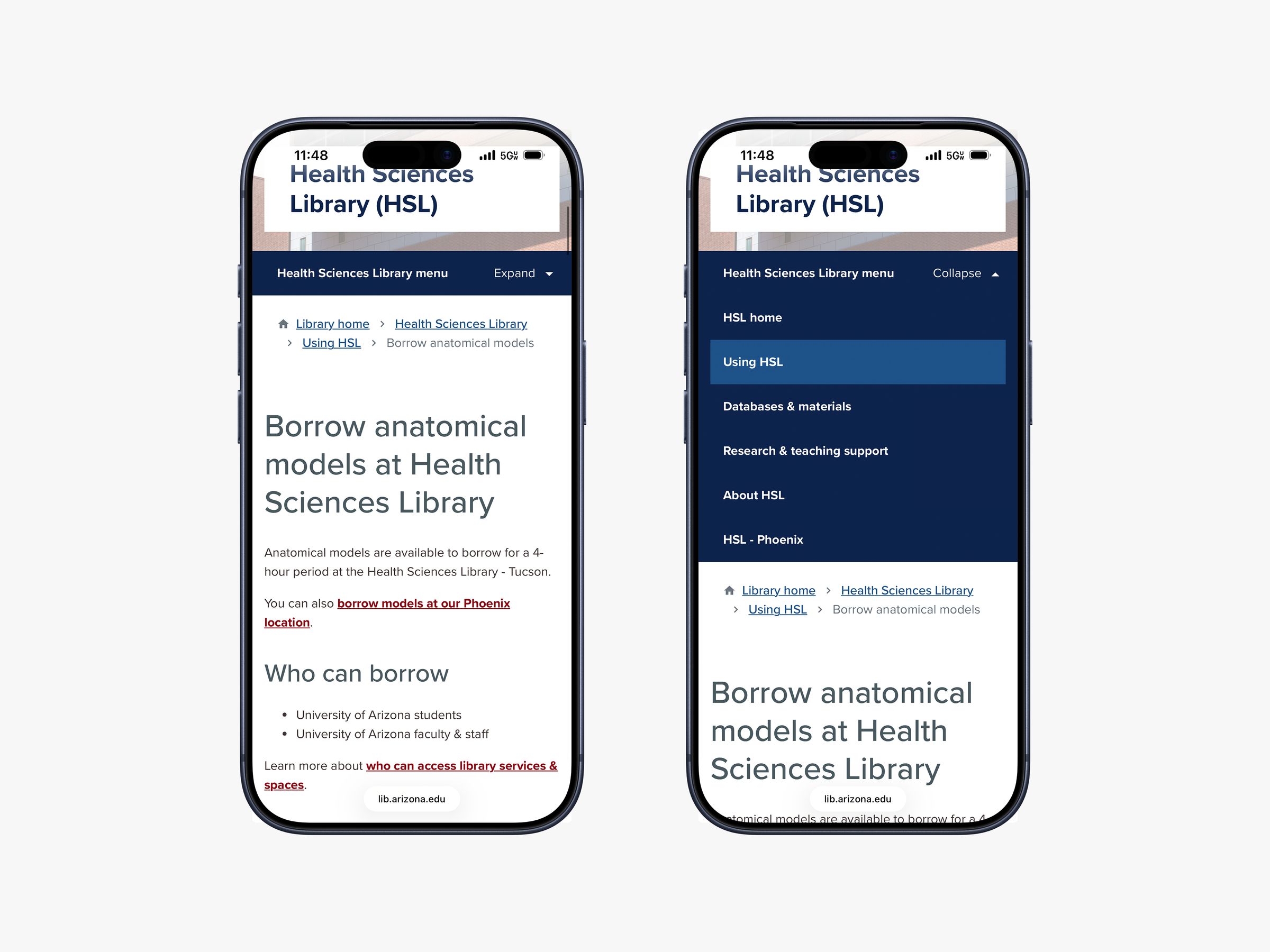
Gathering user feedback was often the “a-ha!” moment that made the team fail and iterate quickly. For example, the secondary navigation pattern on sub-sites, one that we envisioned during a journey mapping activity for the Health Sciences Library, turned out to be a significant source of confusion for test participants. Three iterations were created, each undergoing more usability testing, and the team ultimately implemented the design that met our success rate threshold (80% average on all tasks).
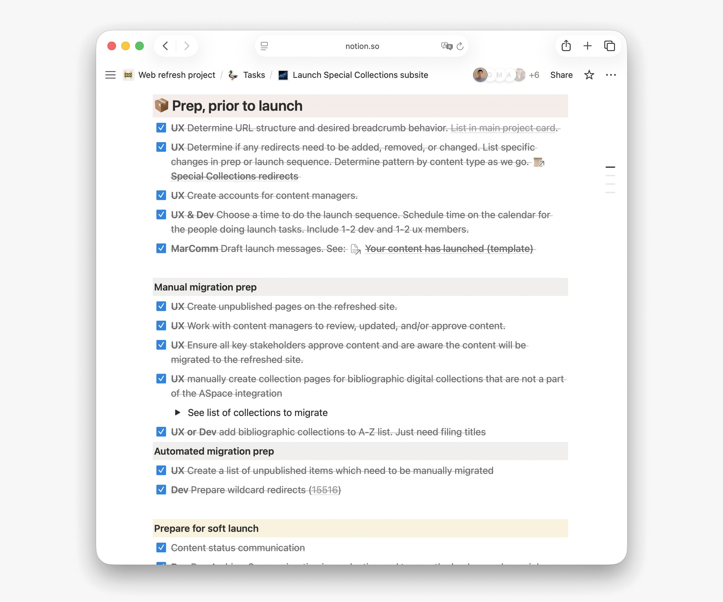
Launch checklist and communications
Immediately before launching each new product, the project team followed a consistent launch checklist. This checklist outlines the implementation and communication tasks that need to be completed, spanning from weeks leading up to the launch to weeks after the launch.
Since many products were migrated from a previous version on a different domain, redirect planning is usually a high-priority task. The project team’s meticulous redirect mapping ensured that all previous URLs continue to work, even after content redesign and domain changes.
In line with the Project Manager and Marketing & Communications Director, who are both members of the project team, I used a strategy to over-communicate project updates to ensure our messages don’t get buried under a pile of emails. As part of my regular communications workflow, I:
- presented project updates at all-staff and department meetings
- sent agenda and handout before workshops and summary after
- shared timely design updates and UX research reports with stakeholders
- sent reminders to workshop and research participants before the event
- in addition to Figma comments, summarized design changes in the designer-developer Slack channel
Sustain the impact: answering “who’s in charge of what”
Before Web Refresh, ownership of products, services, or content was often not clear. Library staff wondered “who’s in charge,” and without a single place to find the answer, the result can be a series of questions bouncing between teams.
Working with different library departments during Web Refresh was an opportunity for me to map the ownership of each online product to its owner. With this information, I worked with other website administrators to design a Web Support workflow, where requests related to website features, maintenance, and communications are gathered in one channel and then routed to the right place.
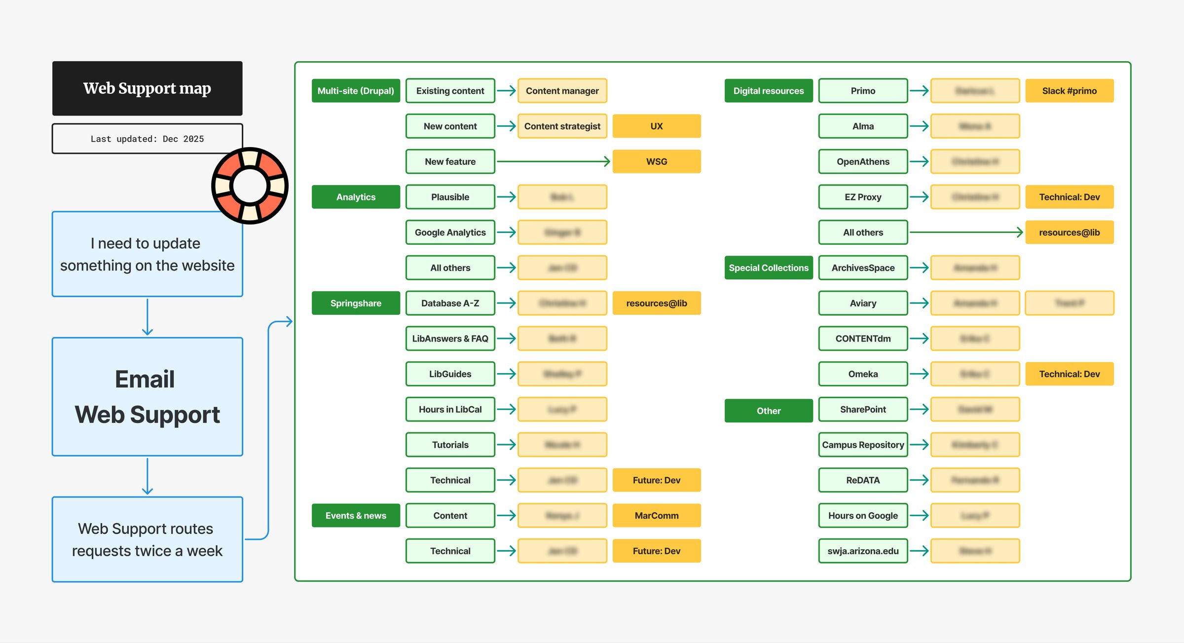
Since the implementation of Web Support in 2022, the new workflow has significantly reduced the turnaround time for website requests. Additionally, the cross-team issue tracker also helps website administrators collaborating from different departments to break silos.
Result
The Web Refresh project revamped the University of Arizona Libraries’ online presence with a new platform and toolkit. In the meantime, new workflows for design-development handoff, content strategy, and website maintenance were implemented and tested to facilitate a more efficient cross-departmental collaboration.
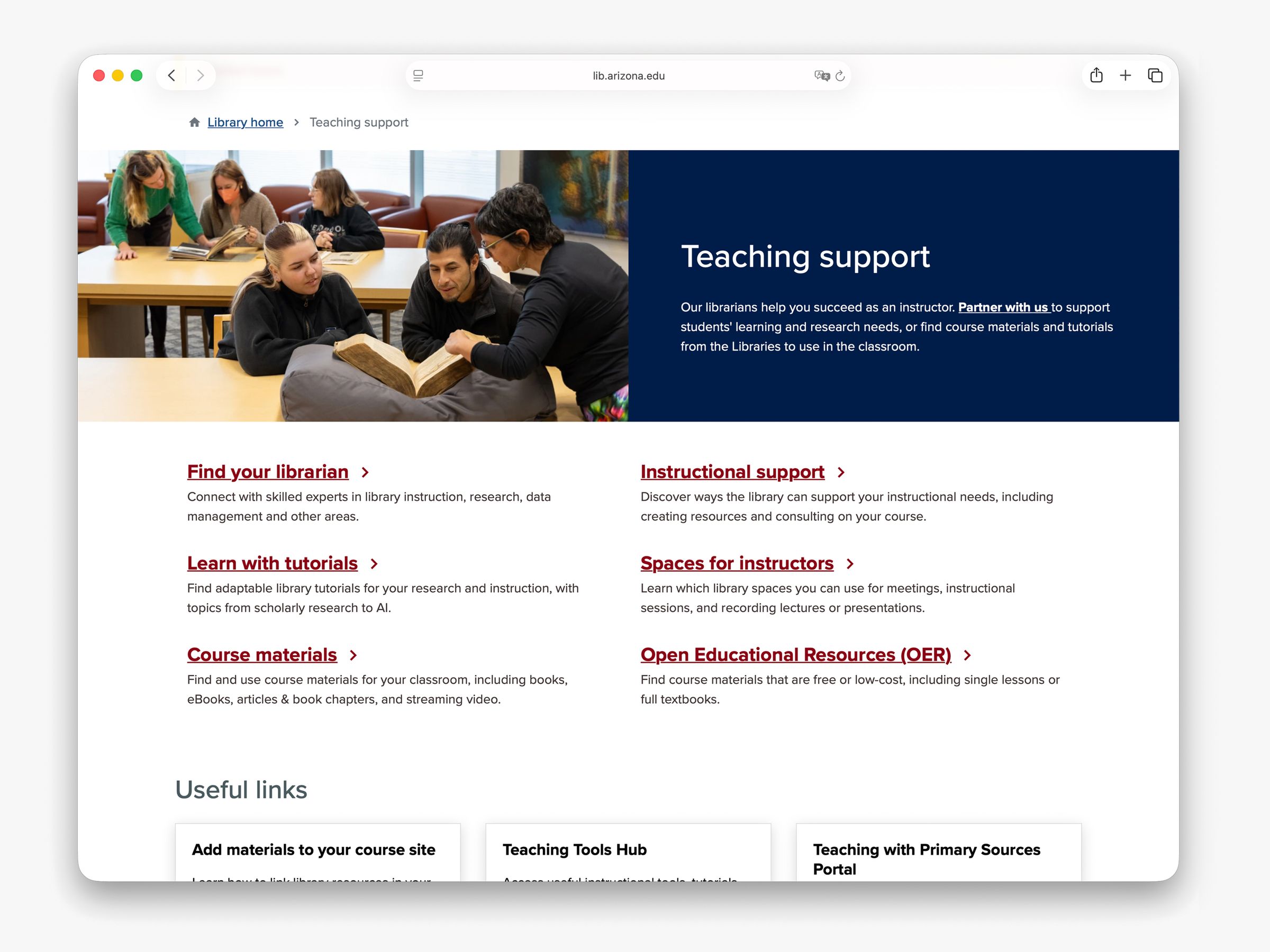
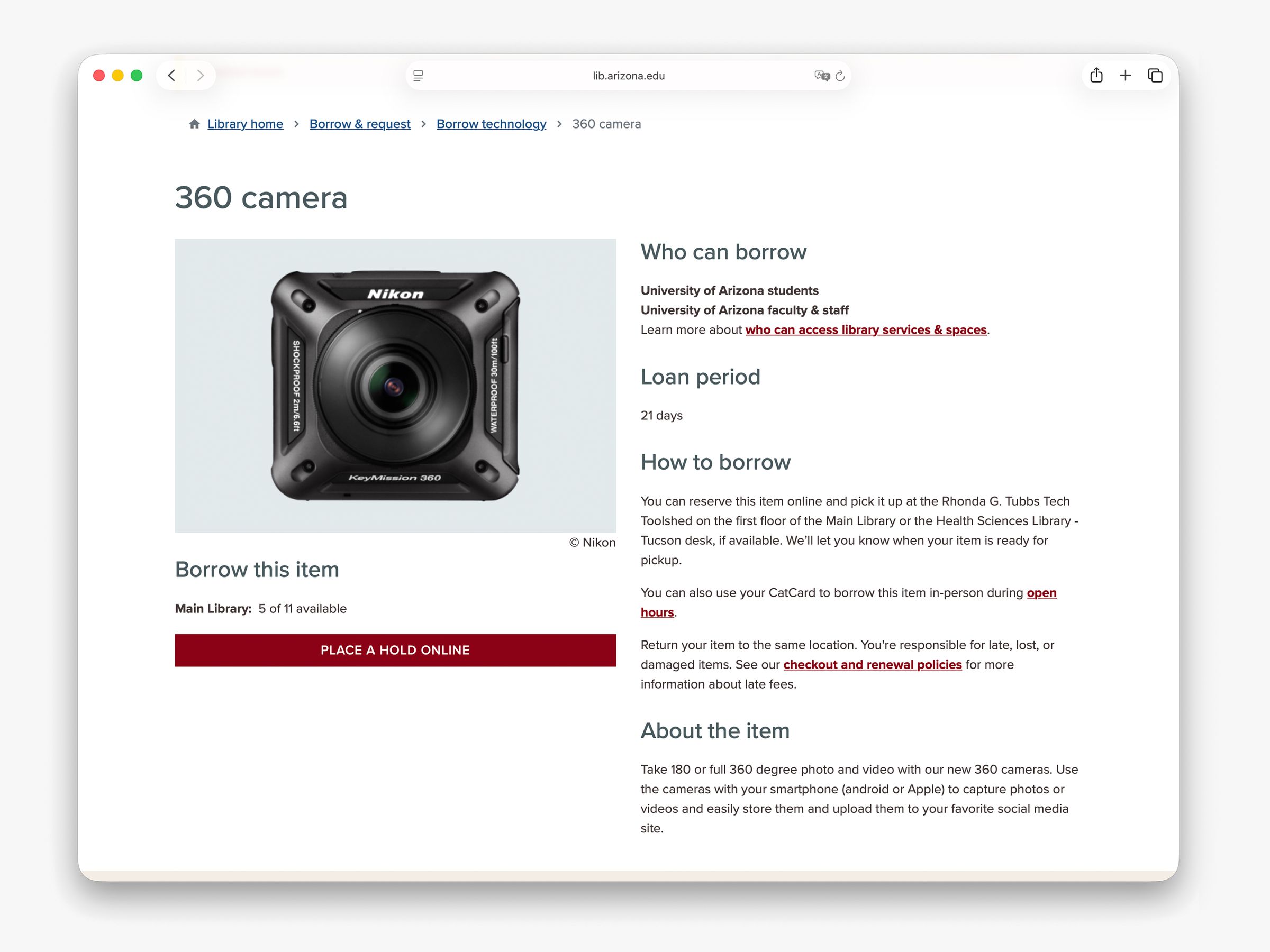
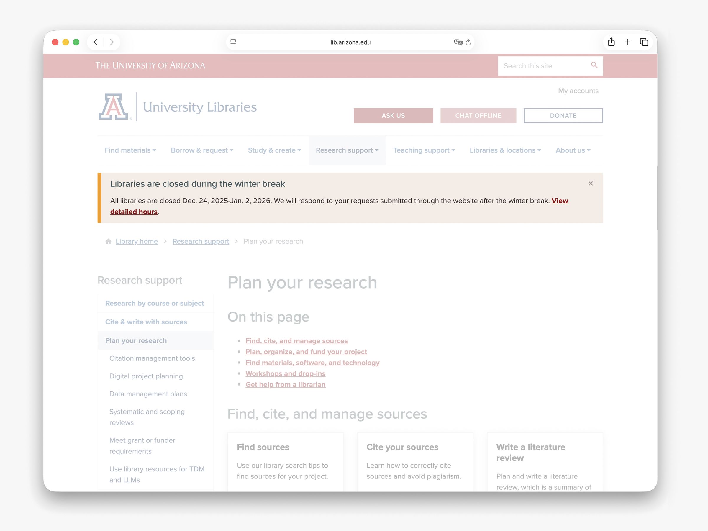
Multi-site
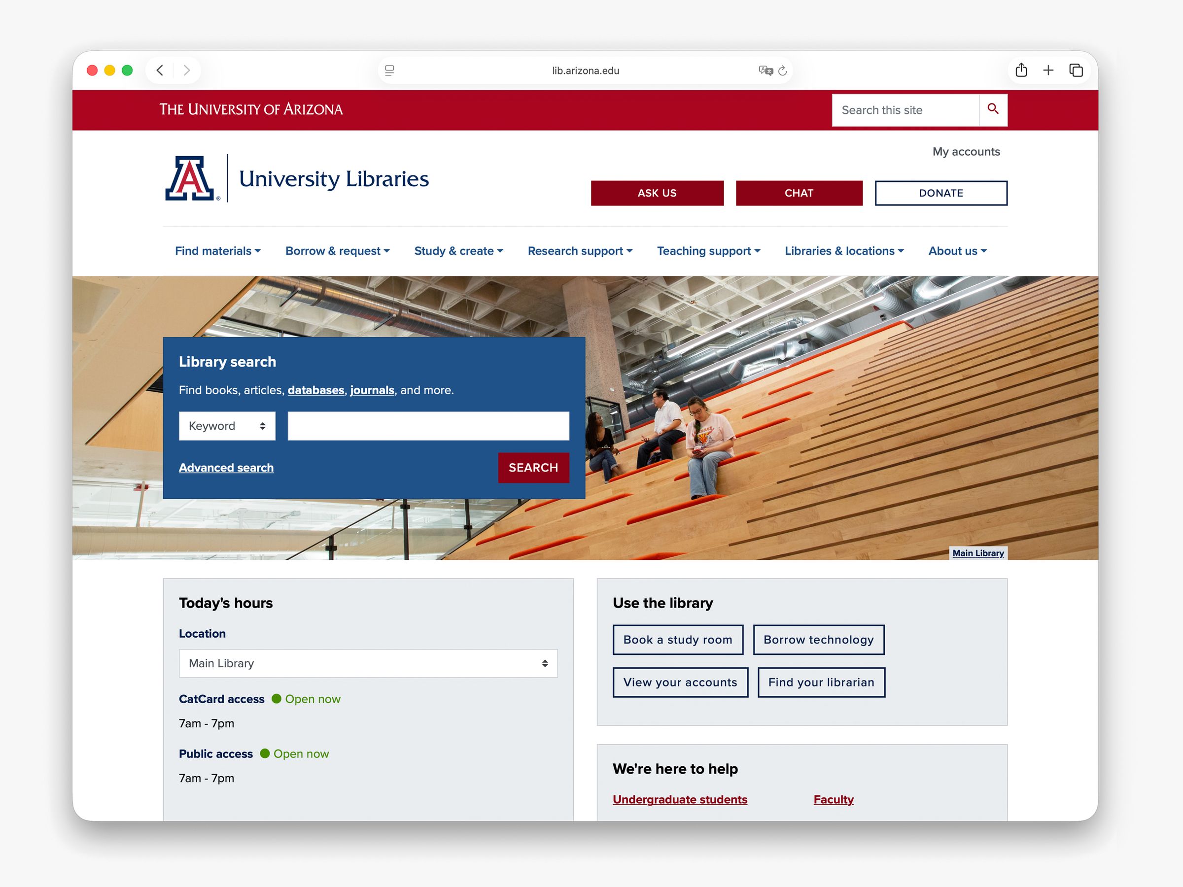
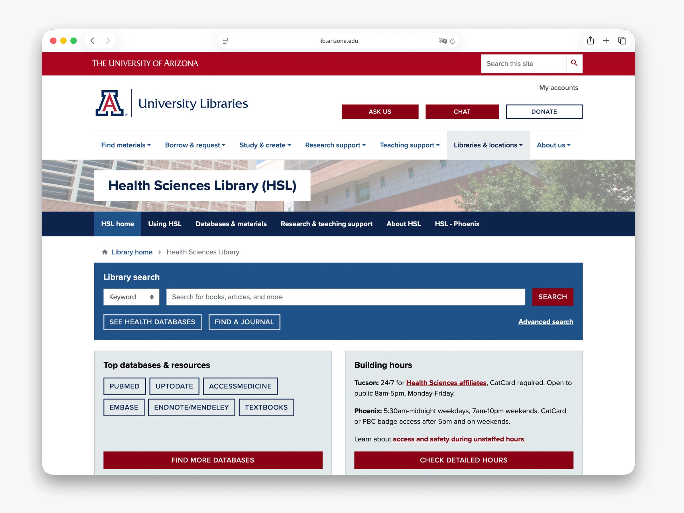
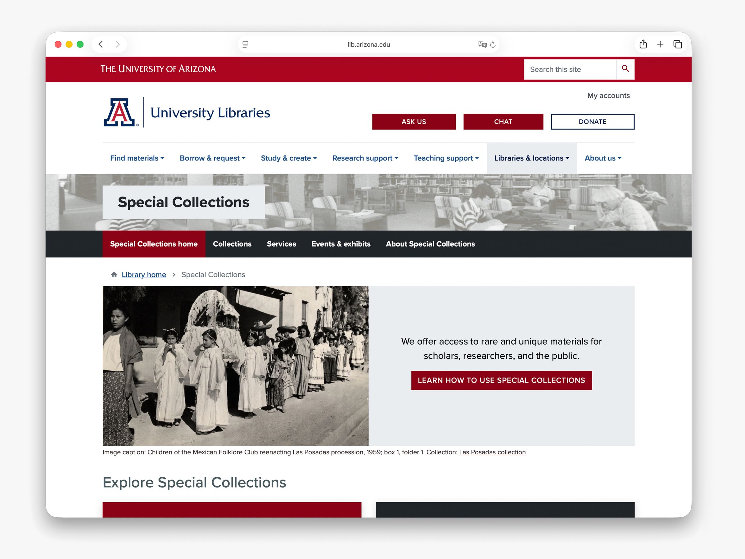
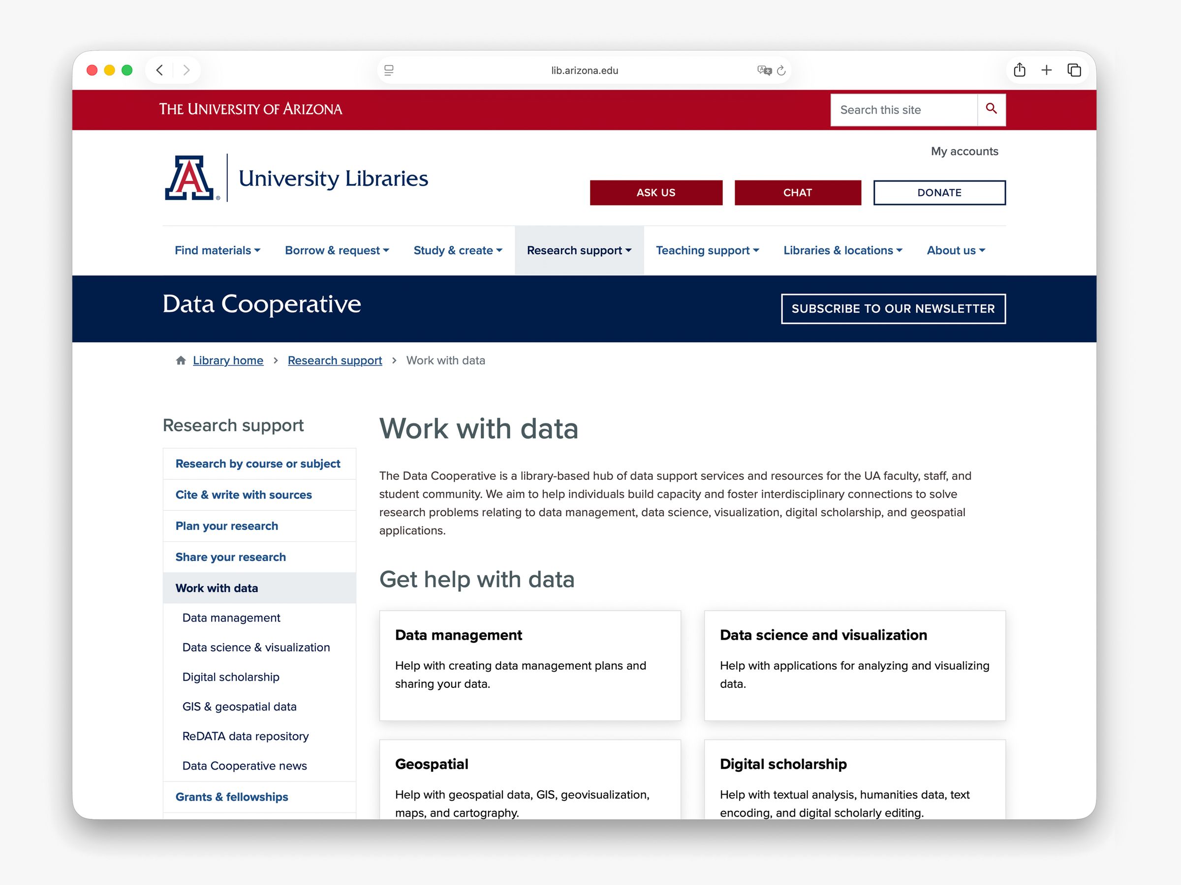
Four library websites were redesigned, built, migrated, and launched under the multi-site structure:
- Health Sciences Library (launched May 2023)
- Main Library (launched November 2023)
- Special Collections (launched April 2024)
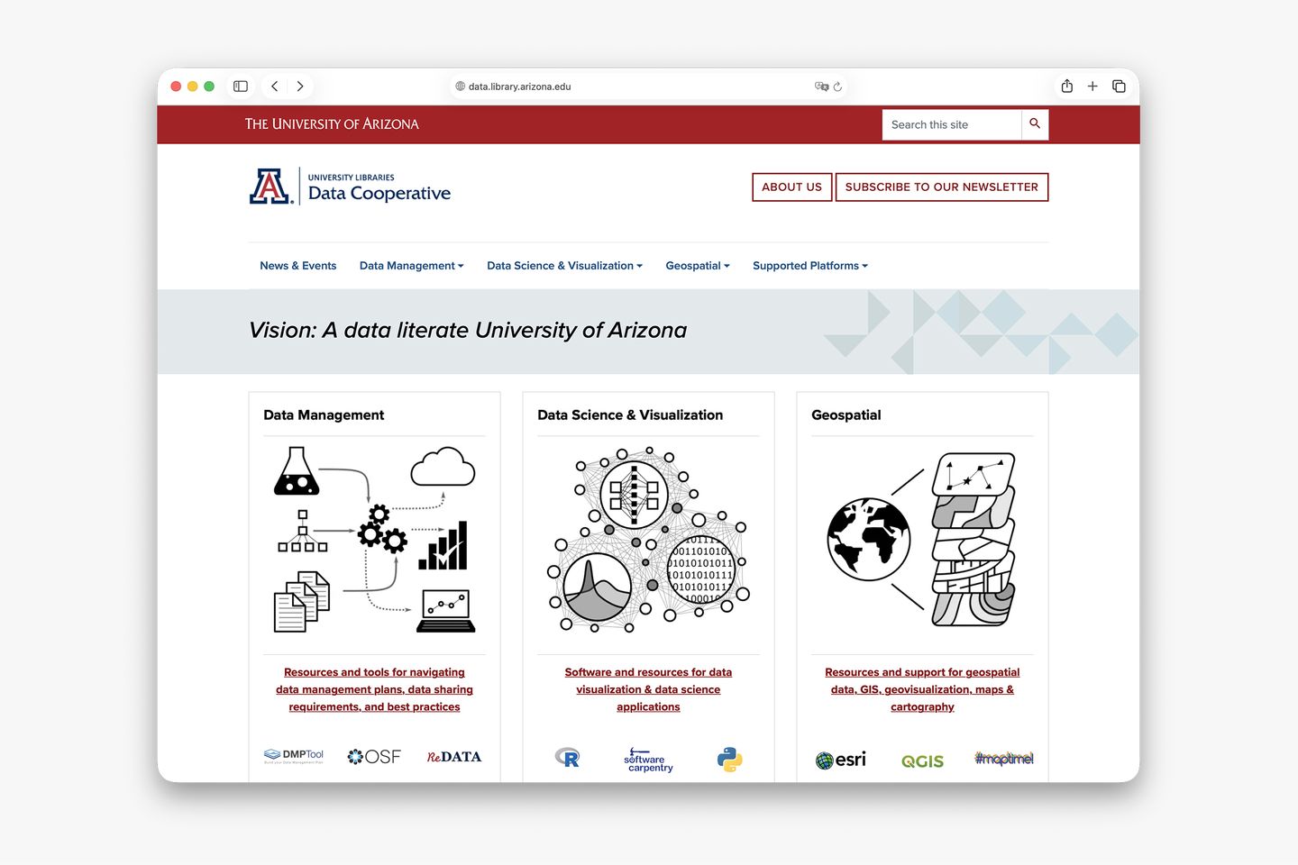
- Data Cooperative (launched December 2025)
Common modules
Each site’s content managers have access to a set of modules that present information in a more useful, accessible, and intuitive manner.