Locked In, Around the Clock
University of Arizona Libraries
2020 · Web Design, UX Research
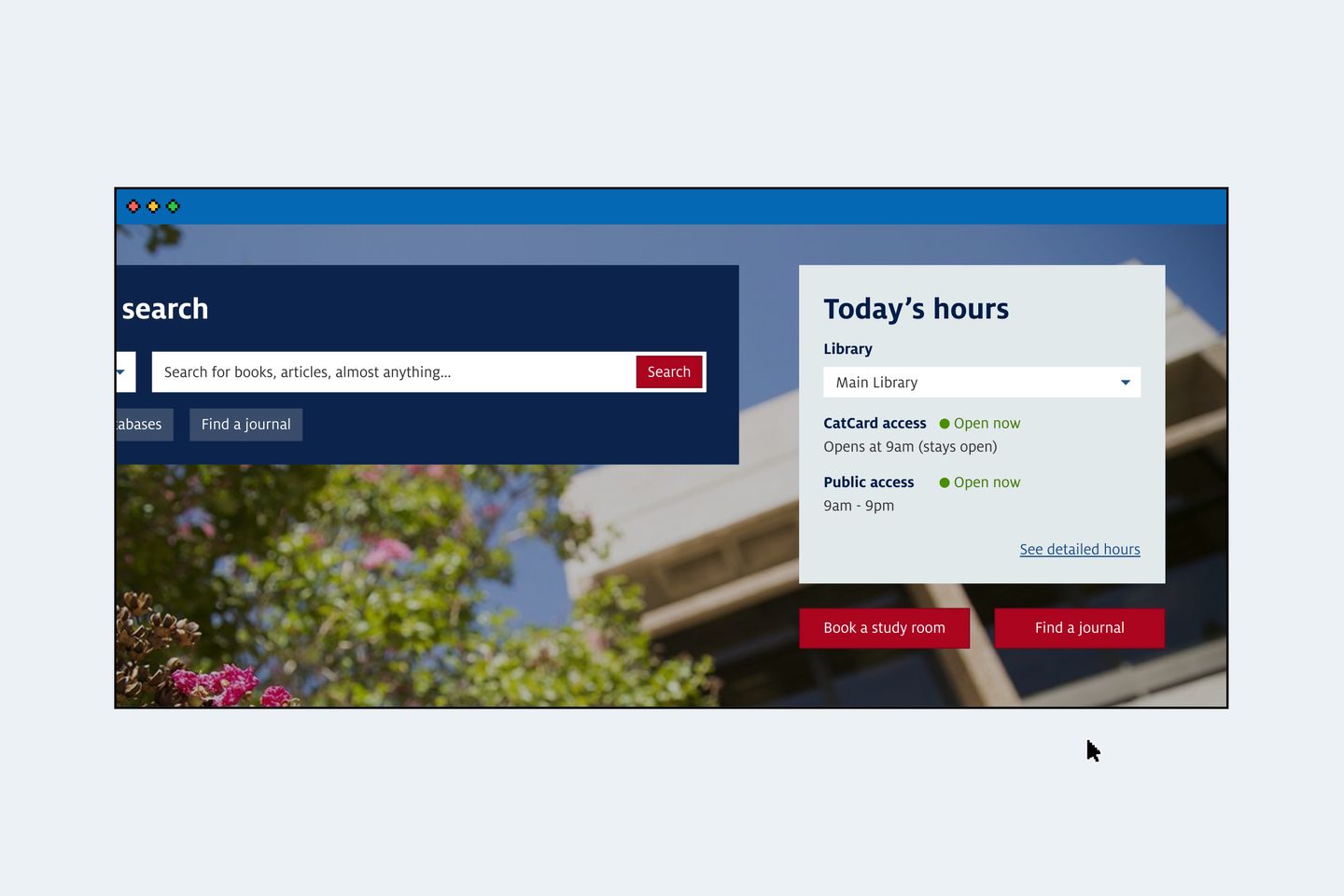
The University of Arizona Libraries has six locations on campus that each operates during different hours. The hours change throughout the year, and can be different depending on the visitor’s affiliation to the university. In 2020, the Libraries launched a new library hours module to address the limitations with its previous library hours page.
I led the project’s UX design and research work.
Research with users
I designed exploratory user research to learn about pain points with the previous library hours page, then worked with other members of the Libraries’ UX team to conduct interviews with 21 students, faculty, and staff at the university.
Pain point 1: complicated access
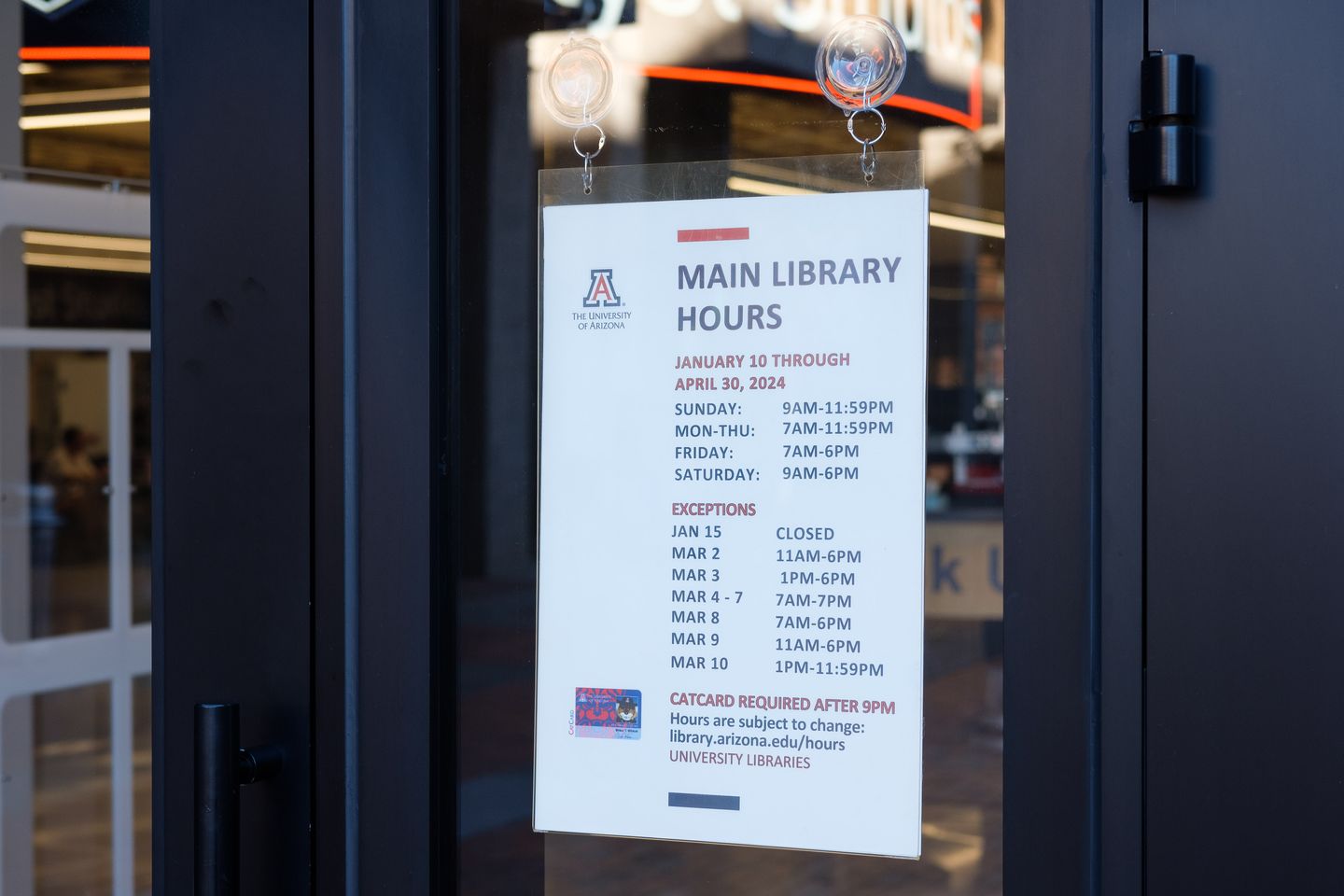
“The website is confusing … I’d rather walk to the library and try to get in. I can at least read the sign on the door.” — Participant #4, undergraduate student
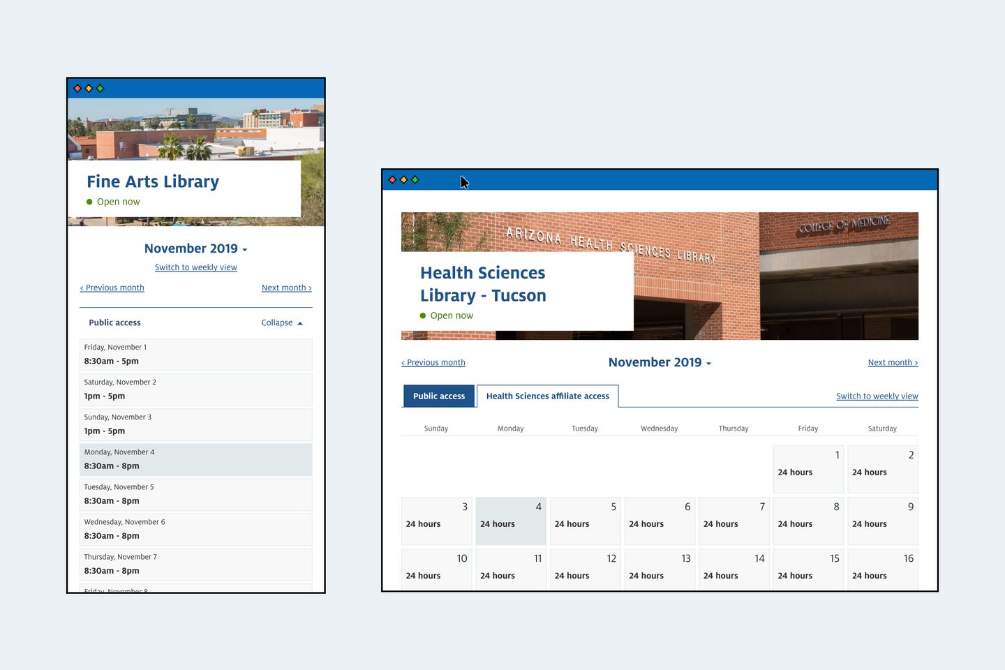
Many library locations operate in two schedules because they provide after-hours access to university affiliates with a CatCard (campus ID). Among all locations, the Health Sciences Library has the most complicated access because only those considered Health Sciences Affiliates can access the building after hours, but not everyone with a CatCard is considered a Health Sciences Affiliate.
Pain point 2: confusing language
“On Sunday, the hours are ‘24 hours’ and ‘opens at 9.’ Aren’t they contradicting each other?” — Participant #11, graduate student
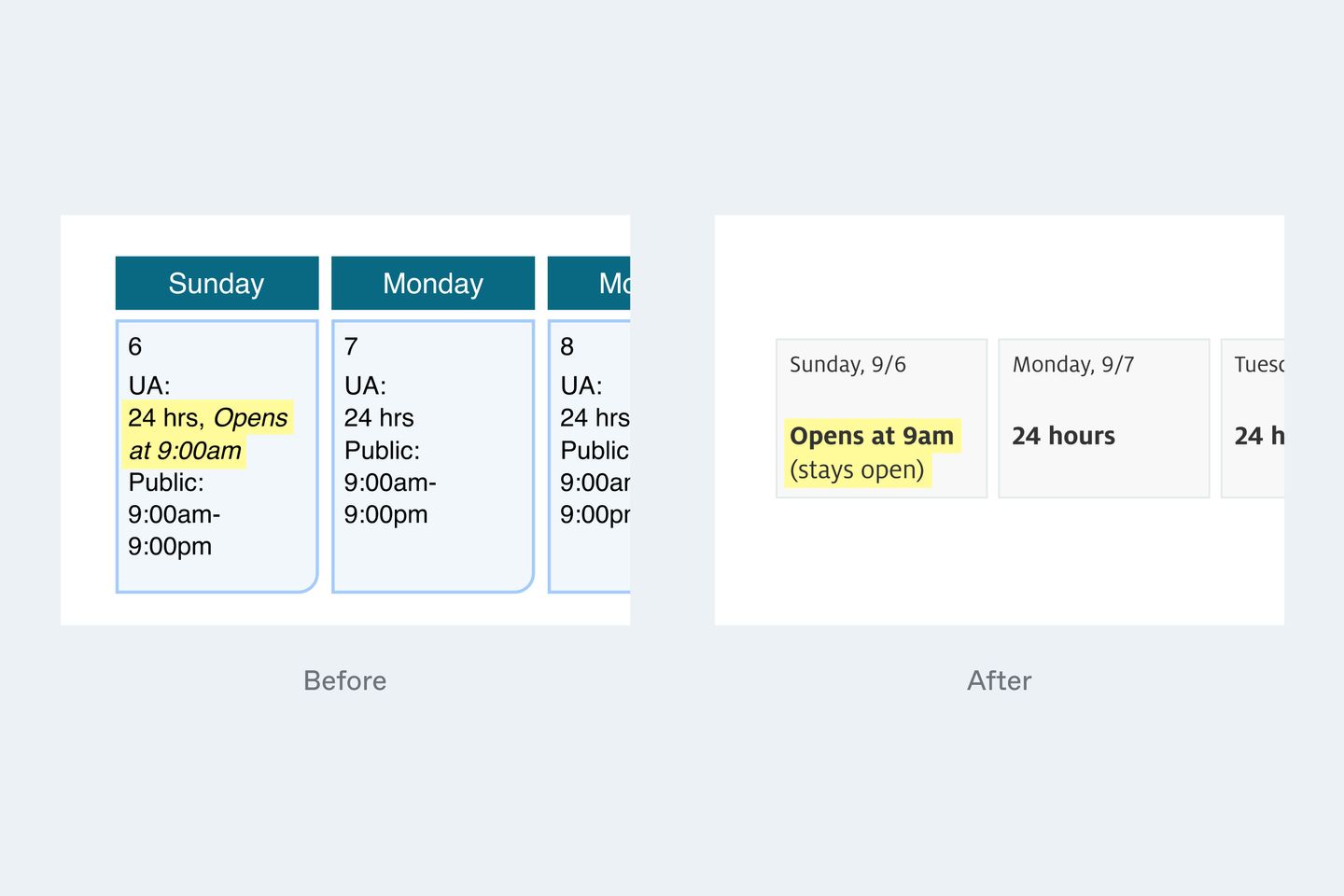
Almost all participants said hours on the library website were confusing, inaccurate, or misleading. For example, on any Sunday in the Fall 2019 semester, the Main Library is open to the public 9am-9pm. However, the building provides after-hours access from 9pm-9am everyday except Saturday, so CatCard holders can enter the building anytime starting 9pm on Sunday through 1am on the following Saturday.
Because of this, the previous library hours page displayed Sunday hours as “24 hours, opens at 9:00am” which confused many participants.
Pain point 3: not mobile-friendly
Moreover, the previous library hours page dates back to 2009. It had an outdated look and was not designed for mobile, which became another barrier for those who check hours on the phone.
Design studio with stakeholders
Our team interviewed the stakeholders from the Libraries’ Access and Information Services team to gather project requirements and success criteria. While working on this project, I created a design activity called Design Studio, which was an effective way of getting stakeholder input from an early stage of the design process.
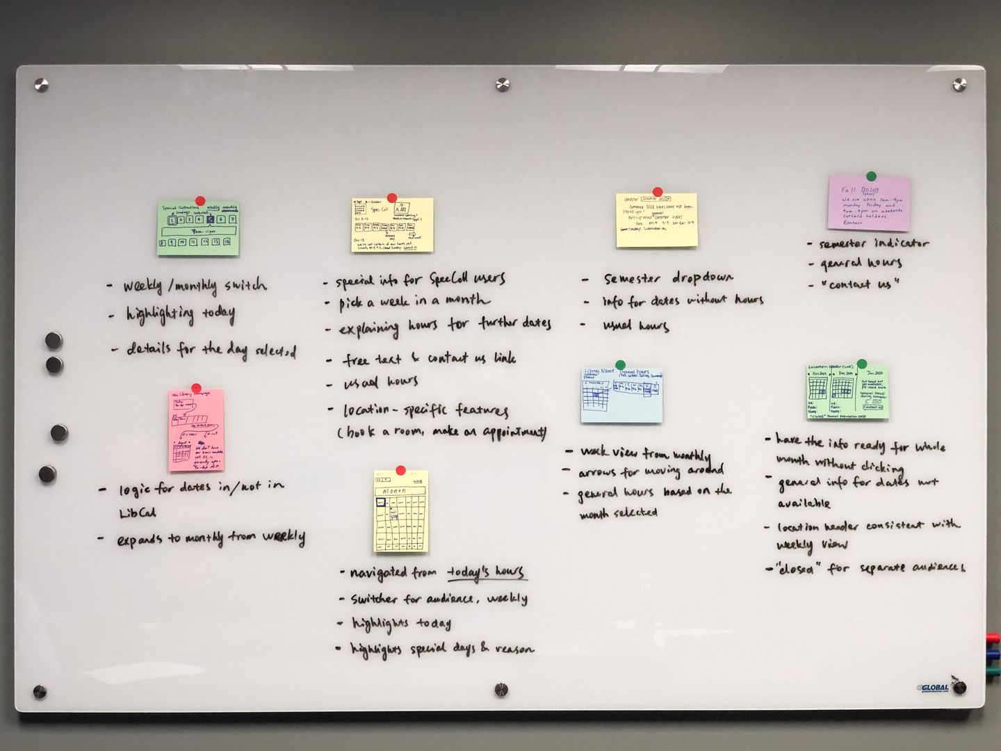
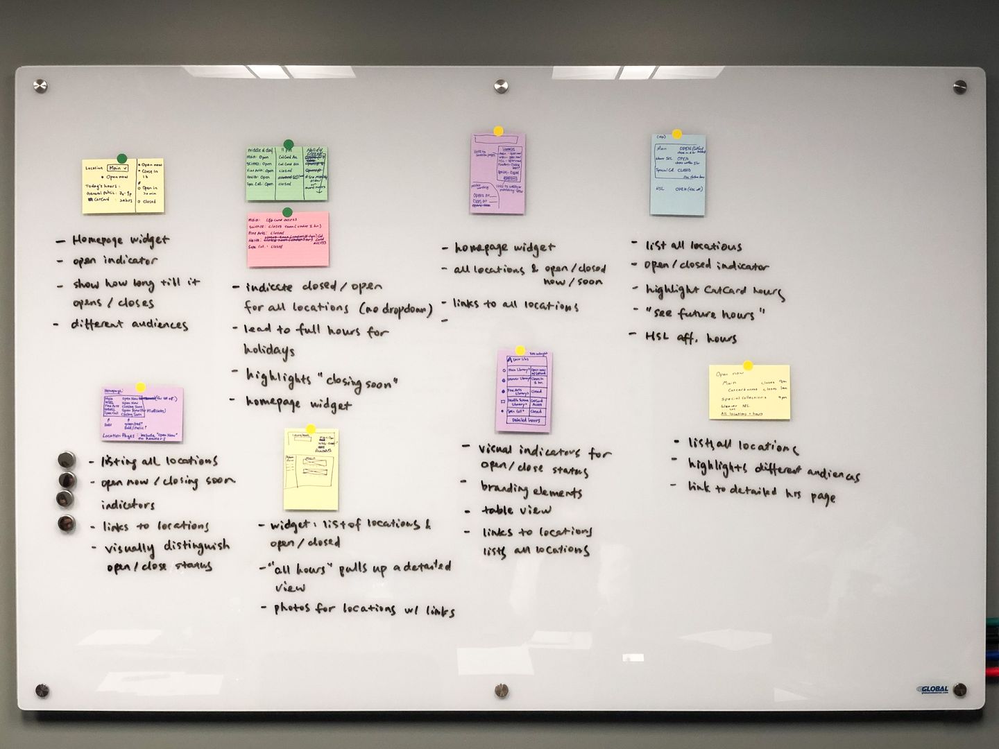
Design Studio is a one- to two-hour freeform activity where stakeholders, designers, UX researchers, and developers gather in a room. Each contributor gets a sharpie and a couple of index cards then follows the same prompt: “In 3-5 minutes, sketch or jot down features you’d like to see in the new product or service.”
During the Design Studio activity for the library hours project, project team members visualized the following features:
- A library hours page with weekly and monthly views
- An hours widget on the Libraries’ homepage
- Clear helper text that explains after-hour access for affiliates
At the end of the activity, I captured, organized, and grouped the responses to summarize top features, then worked with the project manager to draft requirements to guide the design process.
Design & validation
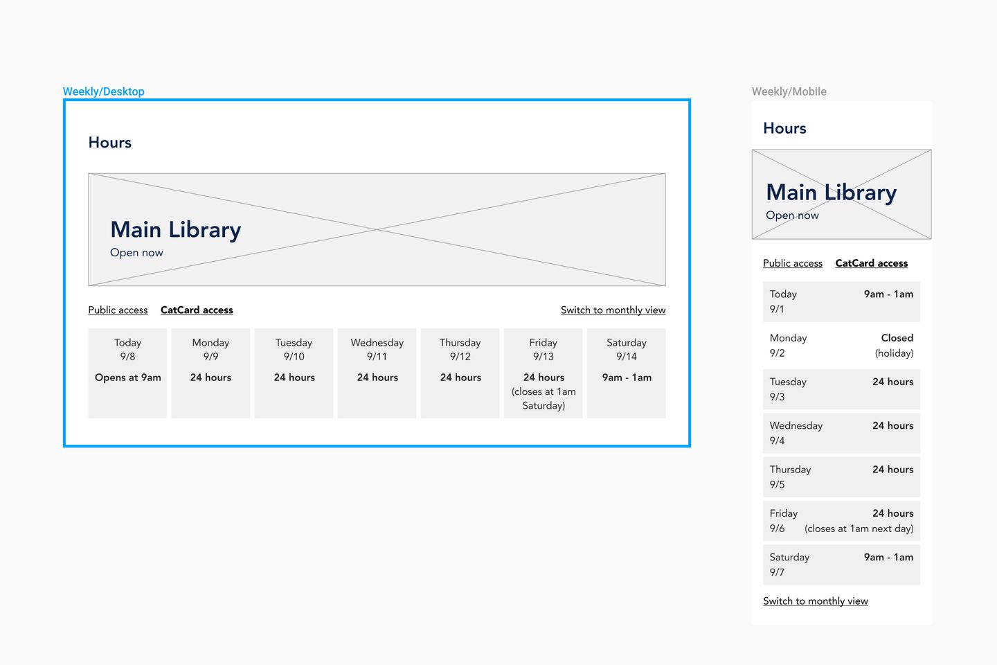
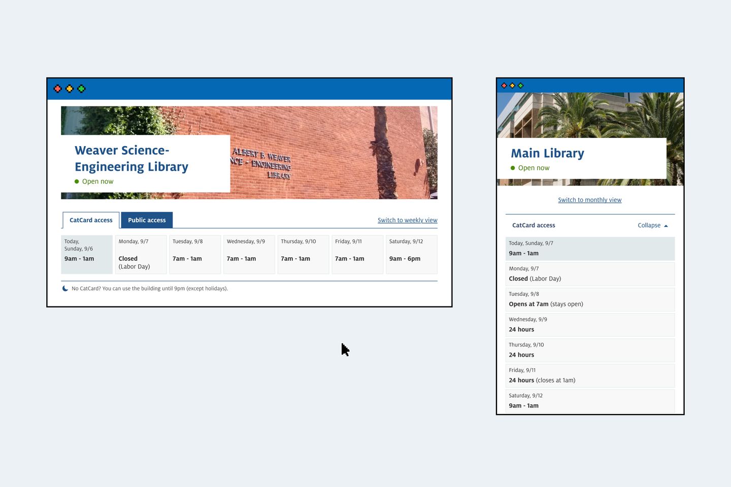
I created wireframes based on input received in the Design Studio. Many sketches contributed by stakeholders hinted at a similar layout, which includes seven squares arranged horizontally to represent a week. I constructed the desktop wireframes based on this layout.
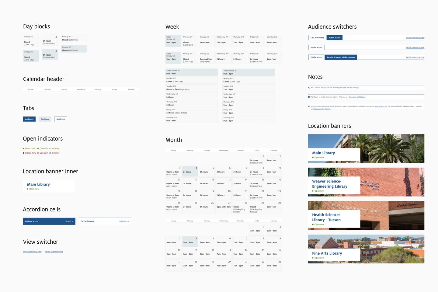
I led the Libraries’ transition to Figma as its primary design and handoff tool. As part of the transition, I built a component library for the Libraries’ Drupal 7-based content management system used at that time. I started this project’s design with the existing component library and added project-specific components and patterns along the way
As I had learned from preliminary research, microcopy design was one of the most challenging parts of this project. Specifically:
- how to indicate that a location is open beyond midnight on a day, and
- how to indicate who is eligible for after-hours access
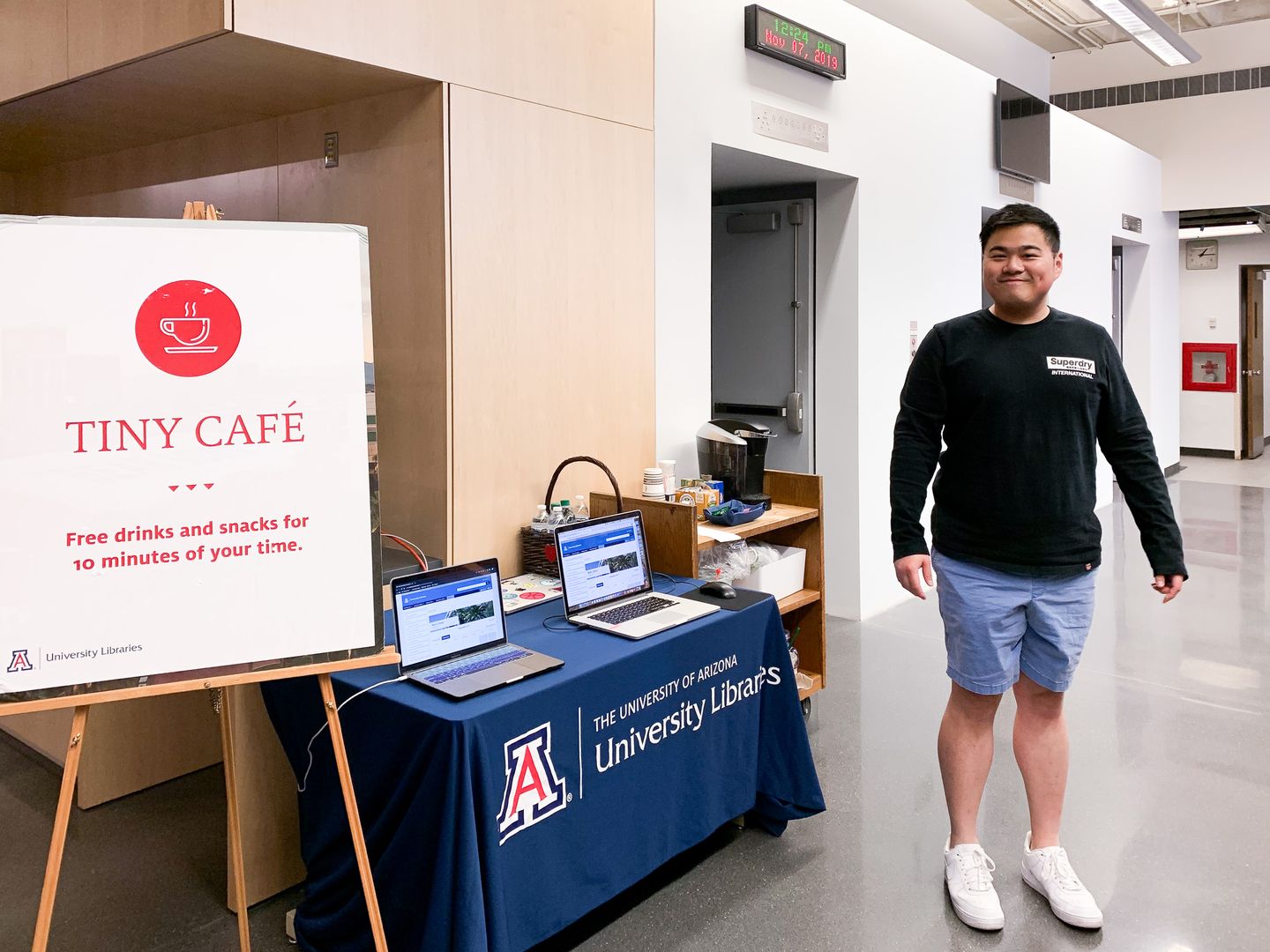
Because of this, I made several versions of the prototype with different microcopy design with which our team conducted usability and preference testing. Our student assistant, America Curl, also discovered a handy roaming testing setup — she put sticky notes with different microcopy designs on a small whiteboard, then walked around in the library lobby and elsewhere on campus asking random students for feedback. In return, she gave them snacks and beverages.
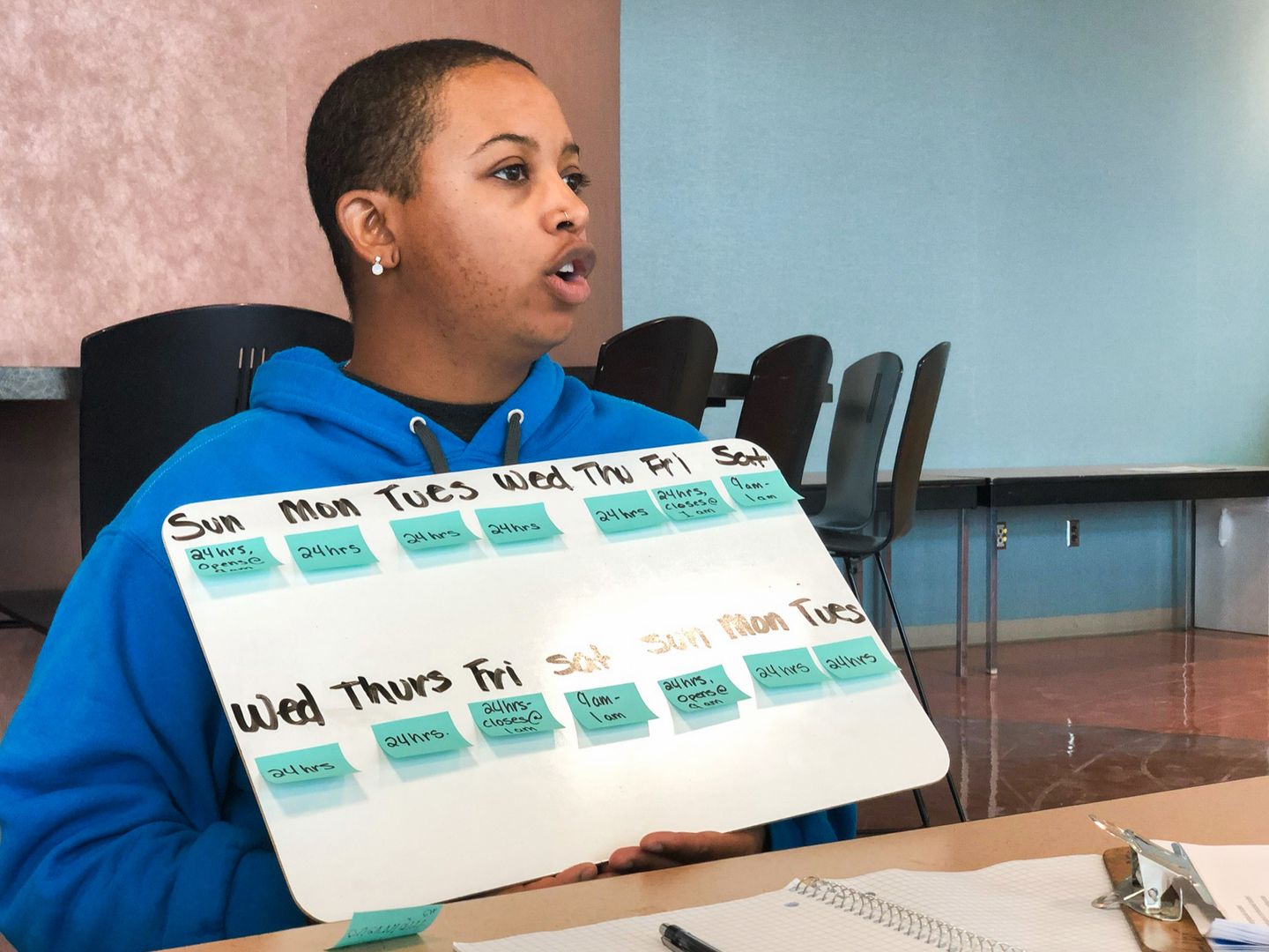
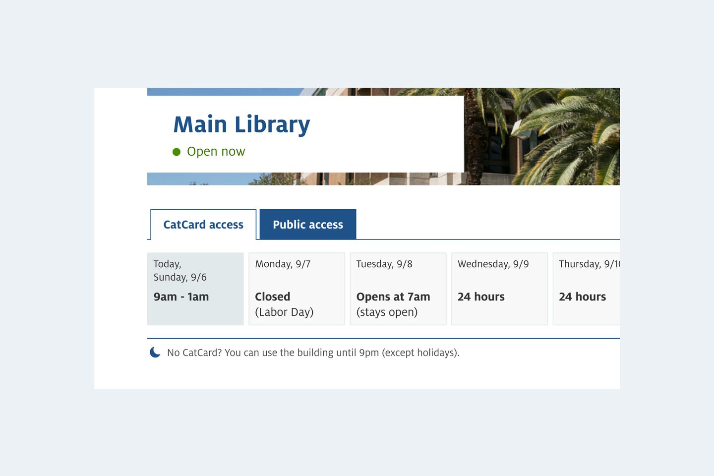
After rounds of testing, we found “stays open” was the pattern most people understood. On a weekly calendar that starts on Sunday, the hours can be displayed as “Opens at 9am (stays open)” on Sunday, “24 hours” on Monday through Thursday, and “24 hours (closes at 1am)” on Friday.
I also added an audience switcher in the UI to indicate different hours for different user groups. In a later iteration, our team also added helper text to the audience switcher to clarify eligibility. Usability testing showed 88% of participants understood who are eligible for after-hours access and what the extended hours are.
Result
The new library hours module was launched in Spring 2020. Shortly after the launch, most library buildings were closed due to the COVID-19 pandemic. However, the new library hours page received very positive feedback later in 2020 and 2021.
Web analytics data in 2021 show the new library hours page had a 60% bounce rate, up from 48% in the previous version. While lower bounce rates are often desirable, the library hours pages are considered an exception — we want the user to come to the page, get the information they need, then leave. So, a higher bounce rate means less users had to navigate to other pages on the Libraries’ website to find the hours.
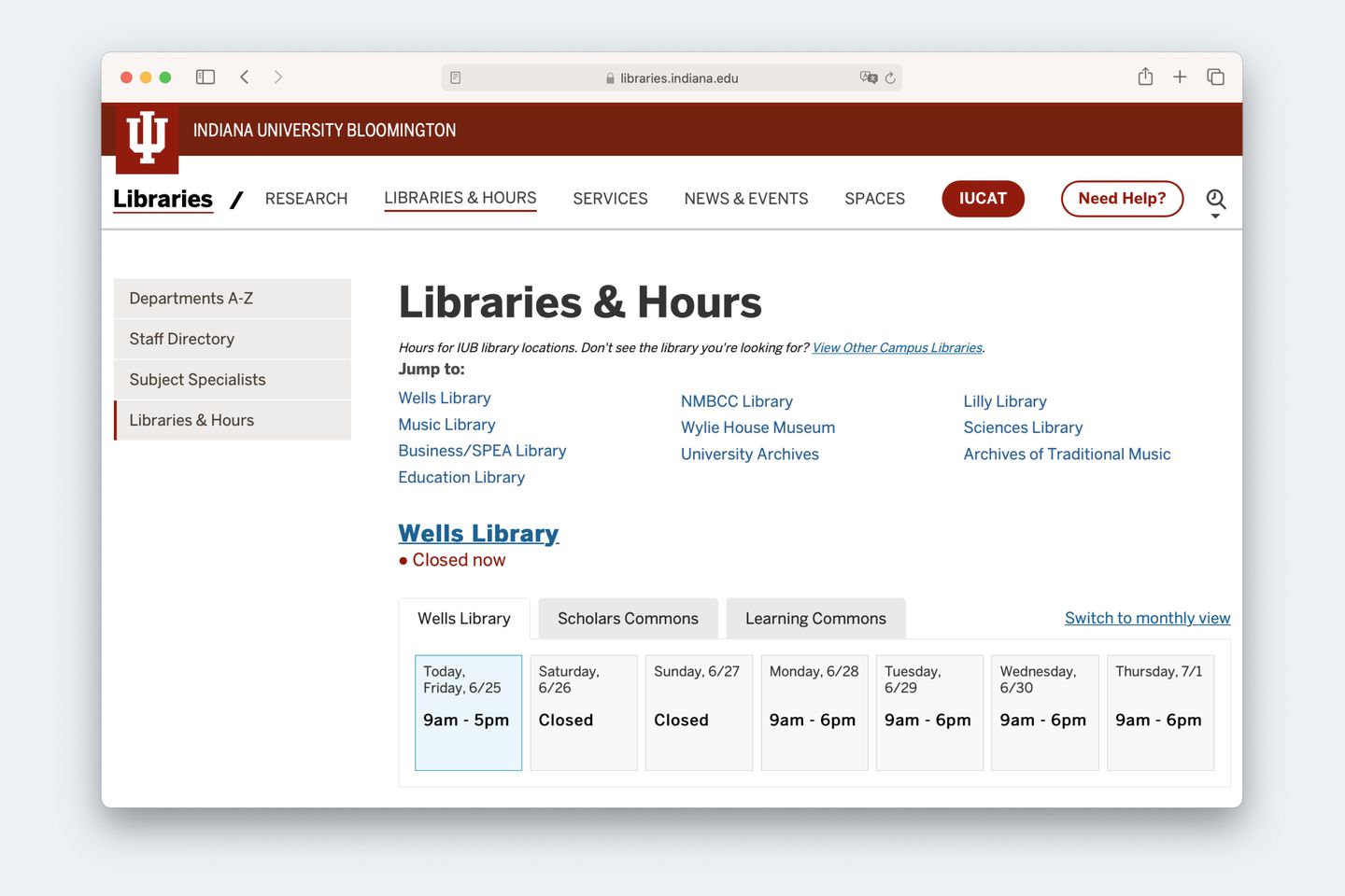
Our project team decided to open-source the project so more libraries can use our solution to improve their user experience. Below is the same design and source code implemented by the Indiana University Bloomington Libraries.
