Designing Future Signs for the Past
University of Arizona Libraries
2025 · Visual Design, Design Documentation
In 2025, my team partnered with the Collection Services department at the University of Arizona Libraries to redesign the library’s collection signage system. We brought creative problem-solving to the interesting challenge of creating a design system for physical signs.
Library signs are unhelpful, if not confusing
As college students increasingly access information in digital formats, locating physical materials in the library has become an intimidating task. The University of Arizona Libraries, which are academic libraries at a public institution, need new signs to solve this problem.
Before starting the project, our team interviewed undergraduate and graduate students, library staff, and student shelvers. Each shared their different perspective of using or working at the library.
Signs are outdated, complicated, and neglected
Wayfinding signs, door signs, and collection signs at the library are managed by different teams. Starting in the beginning of the project, the teams decided to focus on the collection signs.
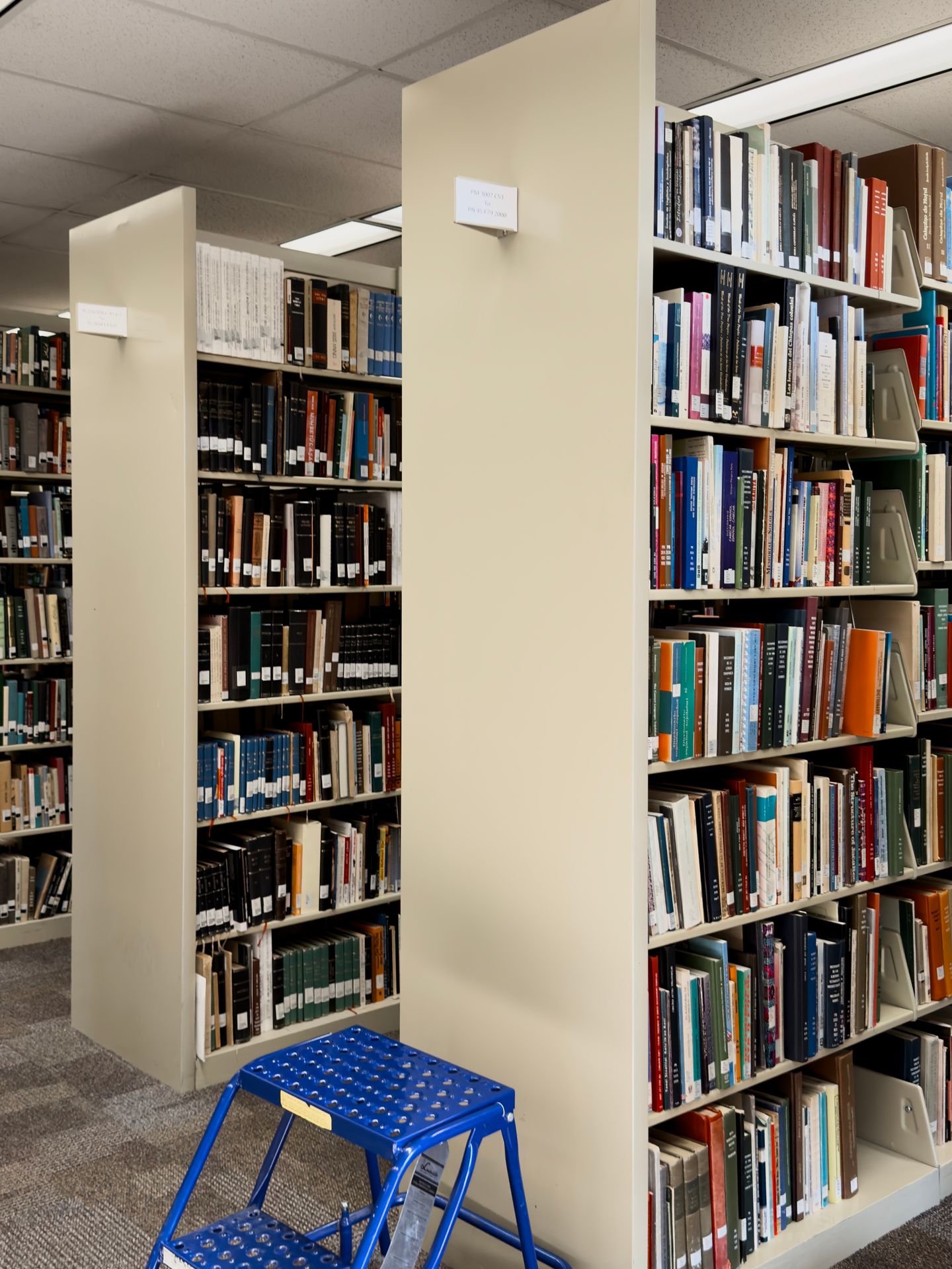
Many collection signs in the libraries are old, with some being suspected to have been printed shortly after the library first opened in the 1970s. Shelves and containers of different sizes are used for library materials, while there isn’t a consistent standard or workflow for producing the signs.
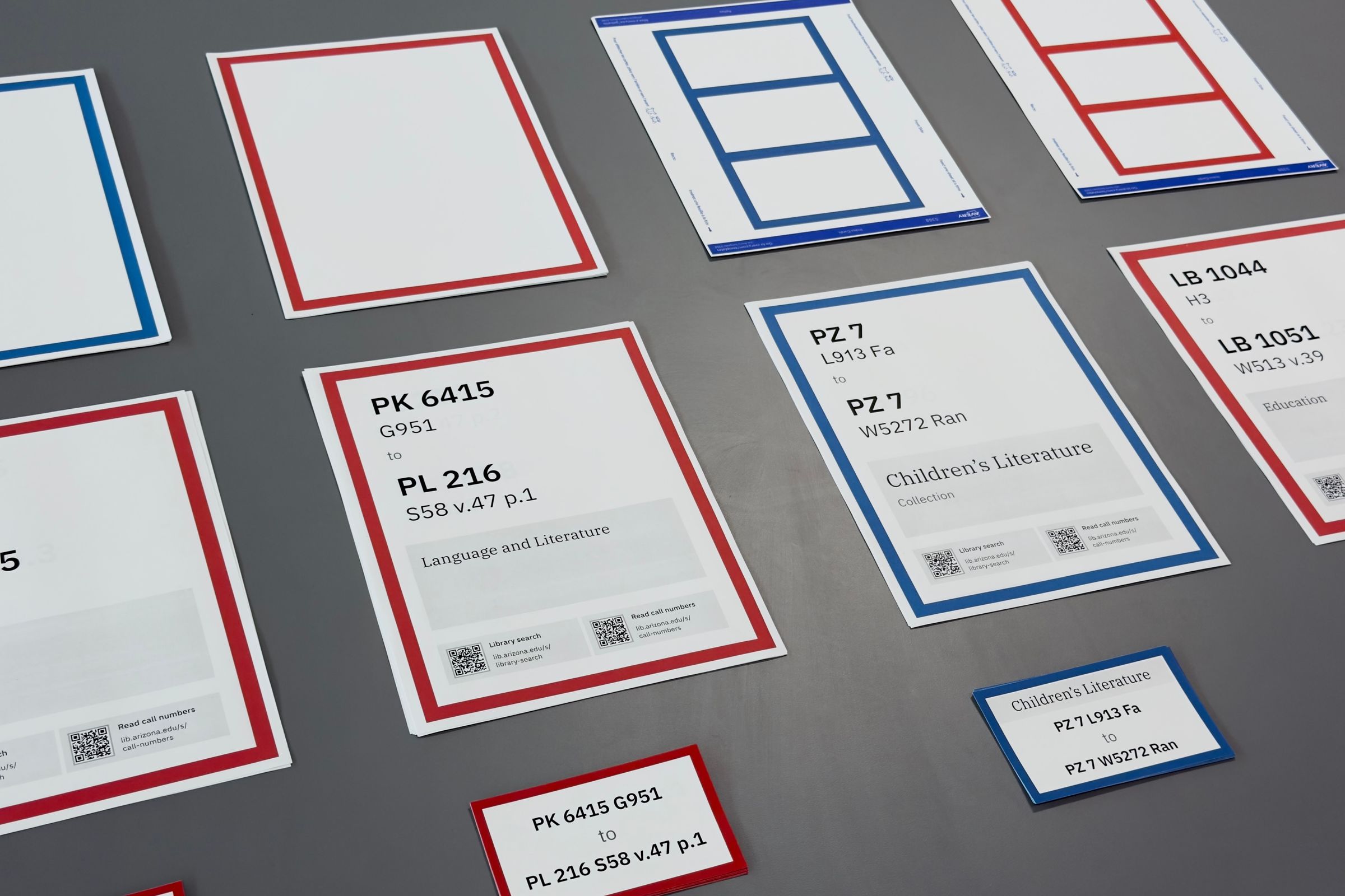
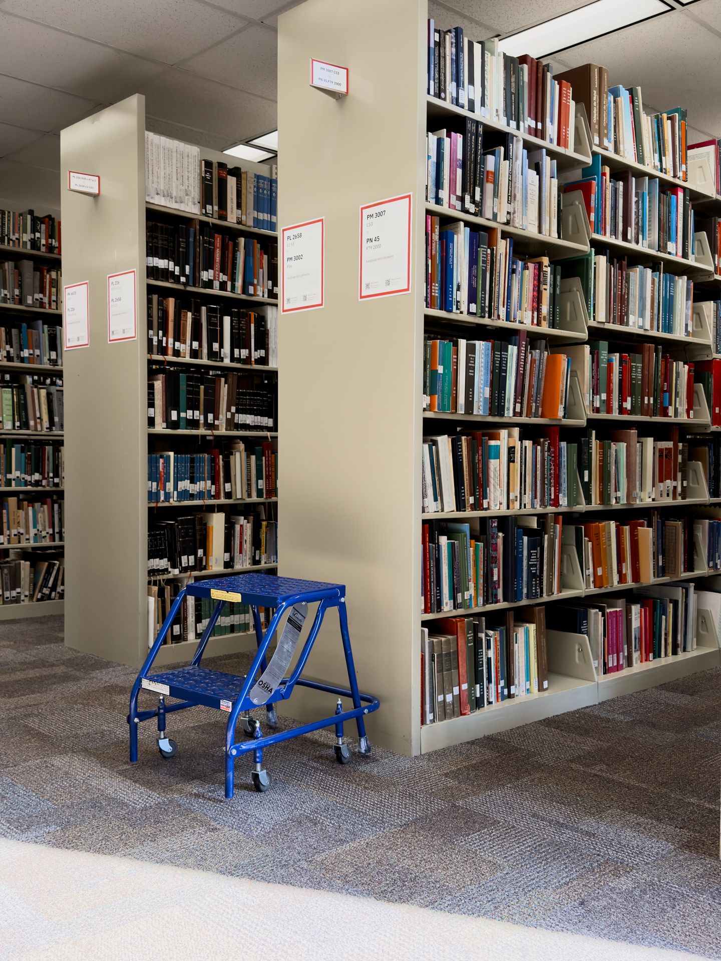
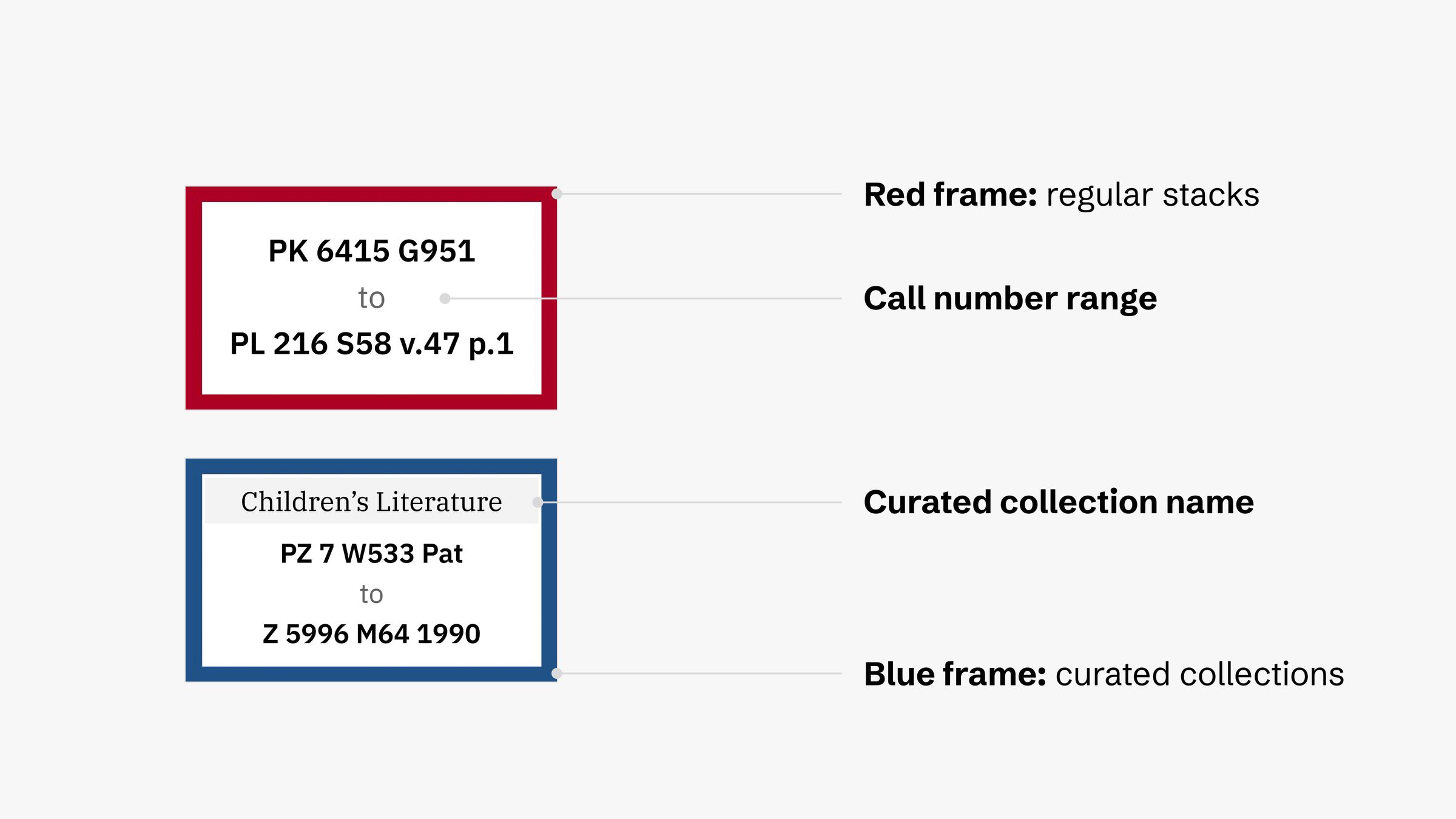
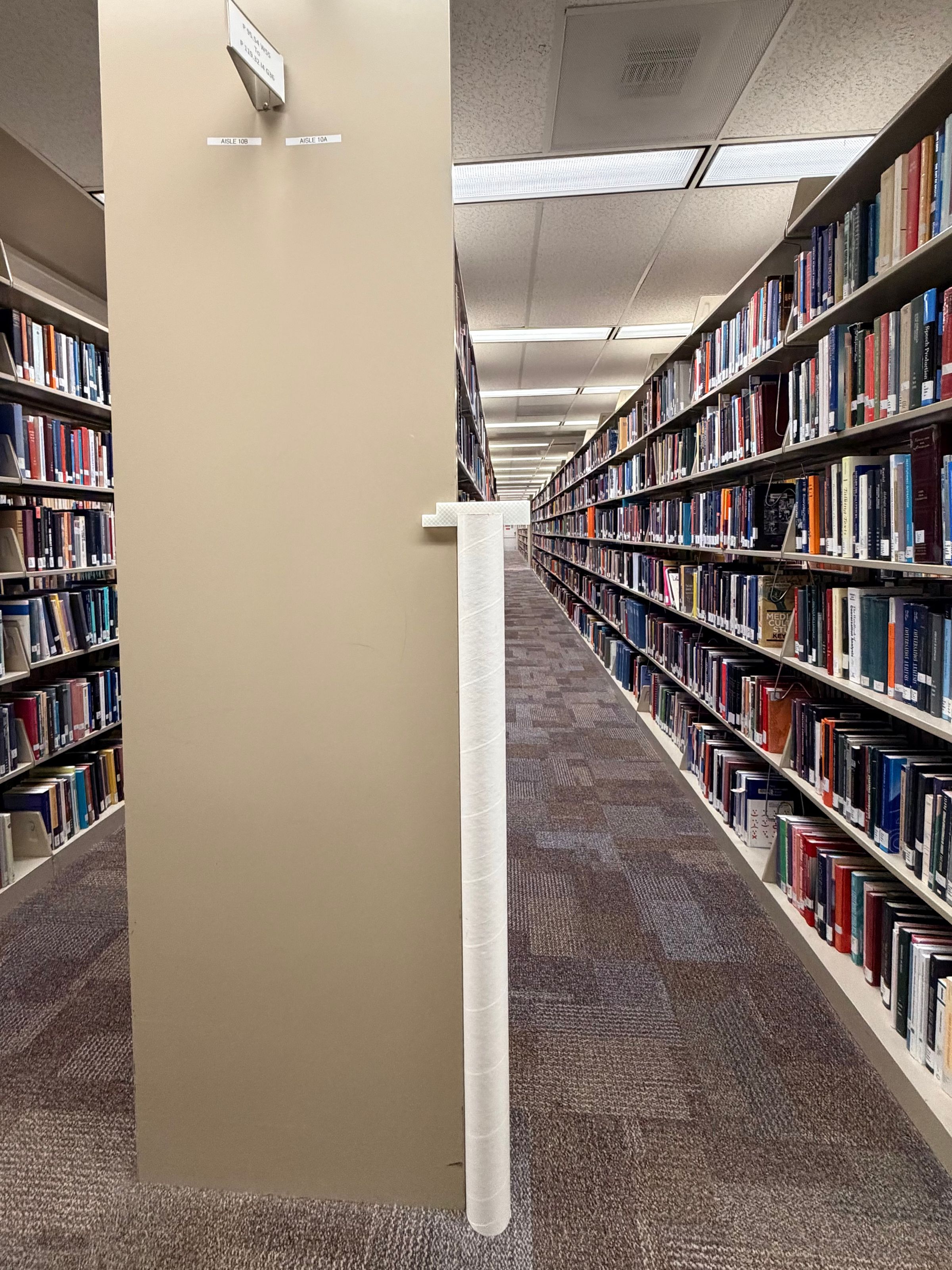
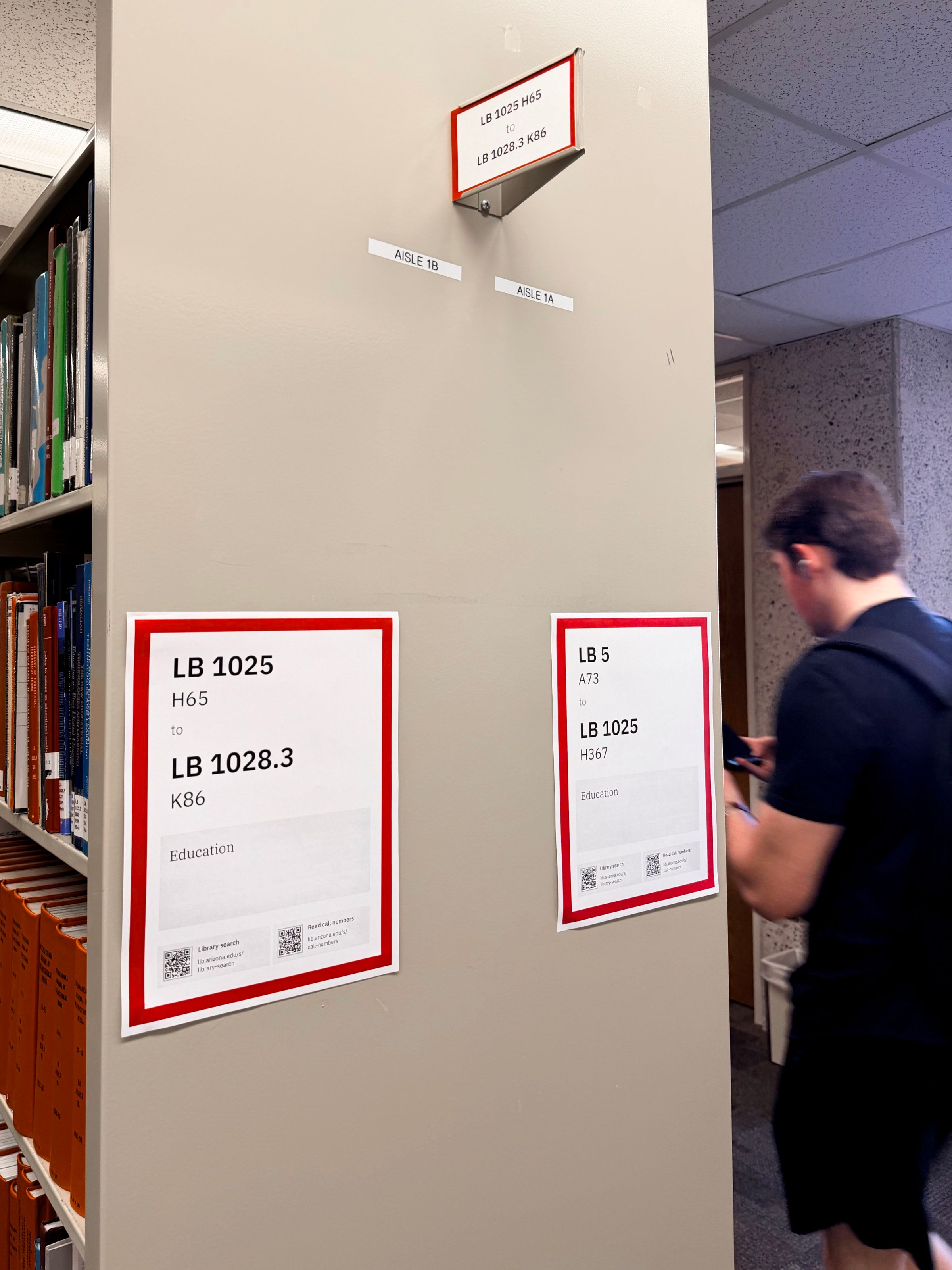
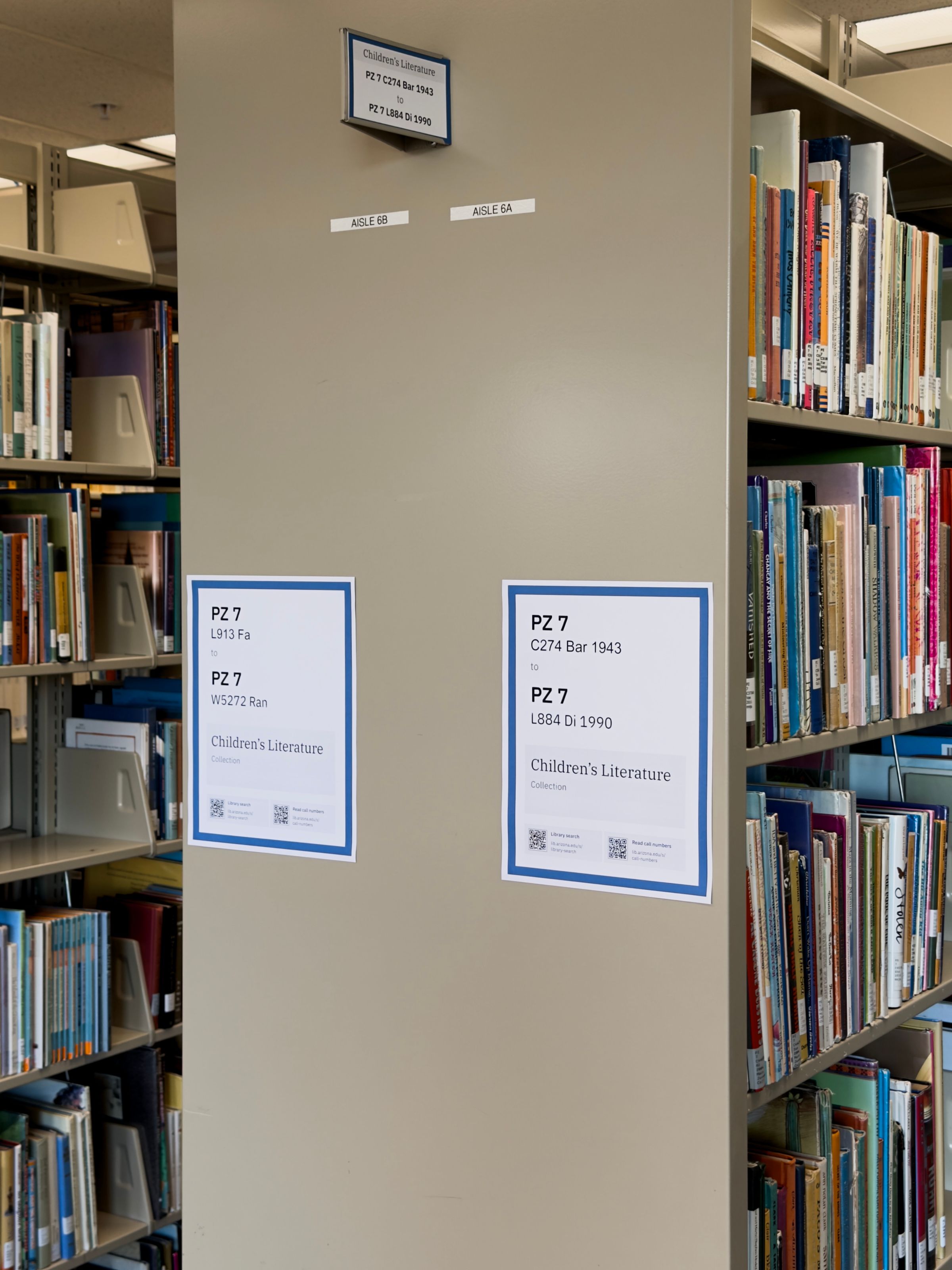
Most books are placed on stacks that only had a sign that indicates call number ranges. This index card-sized sign is placed in a “flag” that sticks out on the top of either end of a stack, so we called it a “flag sign.” We realized the flag is too tall (about 6 ½ feet or 2m) to view from a wheelchair, making the flag sign inaccessible. Additionally, other than the call numbers, it doesn’t indicate what subject the stack holds.
Not everyone knows how to use a library
Many participants the team interviewed don’t know how to use the library. Out of the ten undergraduate and graduate students we interviewed—not including student shelvers—only three have checked out a book from the library.
The University of Arizona Libraries uses the Library of Congress Classification system. Only one participant knew the term “call numbers,” while many others think the numbers are simply dates. All participants think call numbers are confusing since they don’t explicitly say the subject.
Collections shift often
There are frequent changes in space and constructions in the University of Arizona Libraries that causes collections to shift. Each time the books are moved, signage on the stacks needs to be updated too. This adds burden to the library’s Print & Collaborative Collection Initiatives Unit, the team that manages the stacks.
Cost awareness
In the planning phase of this project, I spoke with various stakeholders at the library including the leadership. Budget was a common theme for these conversations, especially when people picture any collection shifts in a bigger scope.
Goal
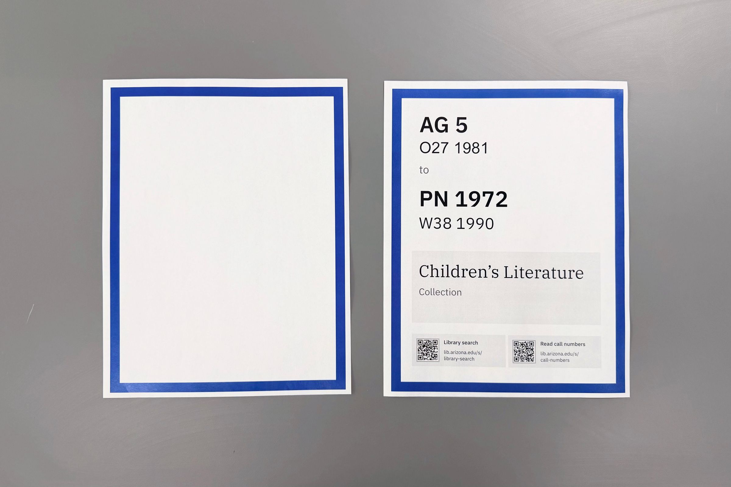
We want to design signs for regular stacks, which include the majority of books at the library, and the library’s curated collections.
We want a signage system that:
- makes browsing more intuitive
- makes it easier to update collection signage
- is cost efficient
To meet our budget limitations for the signage system, I also designed with the following restrictions:
- Use common office supplies.
- For installation, use easily accessible tools instead of specialized equipment.
The design
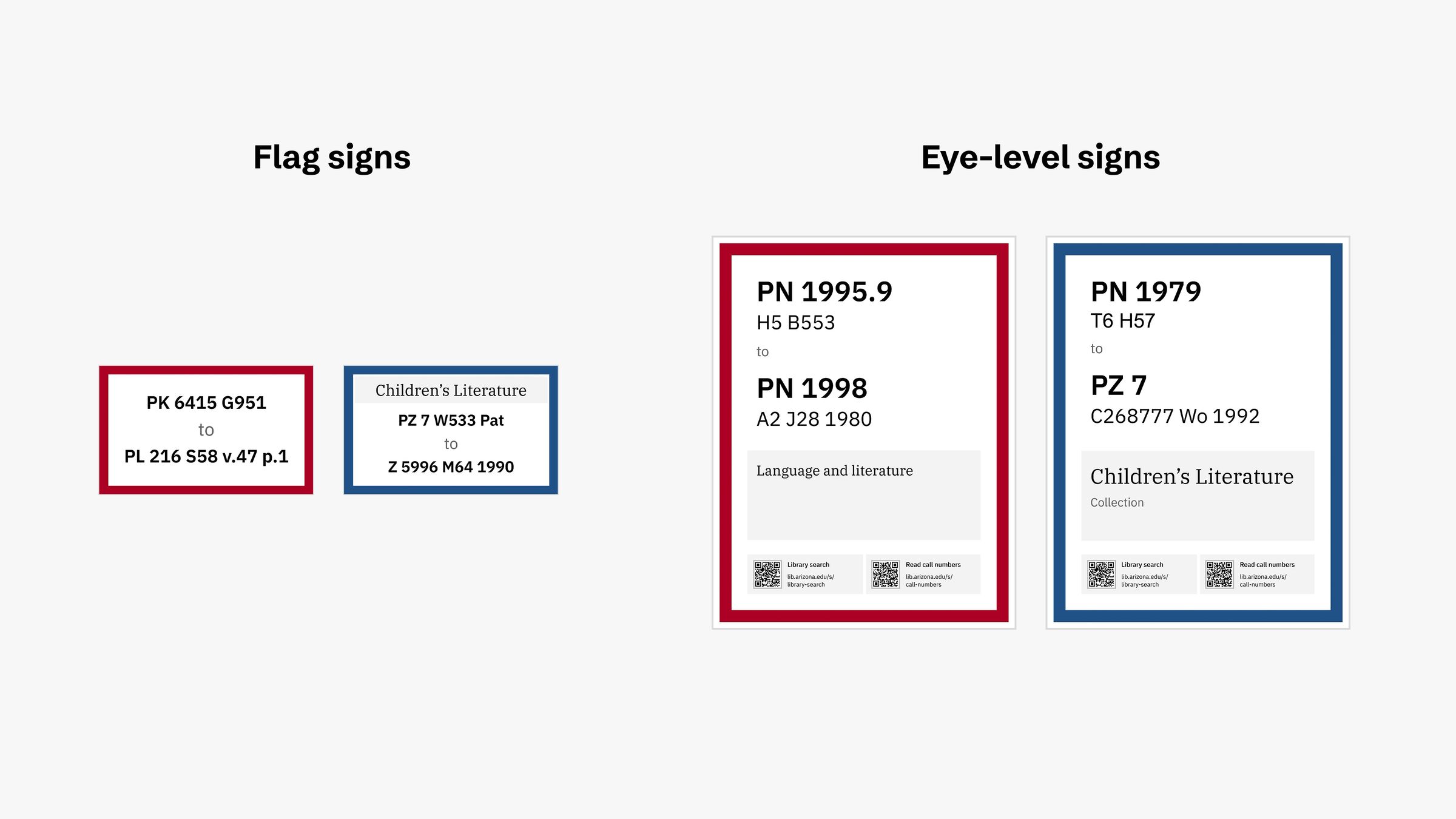
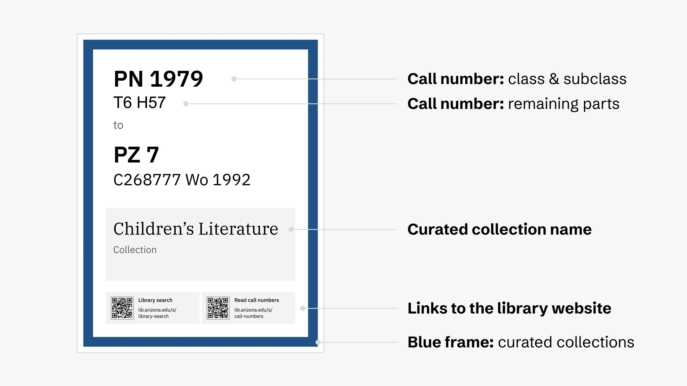
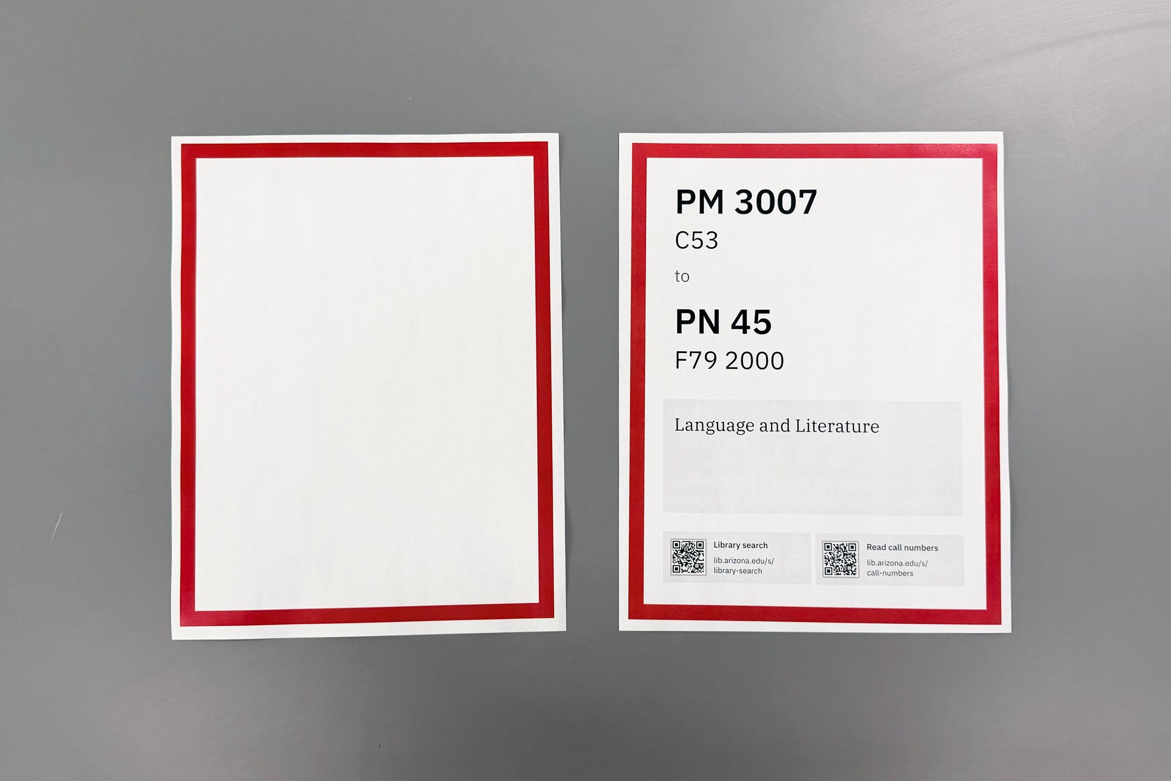
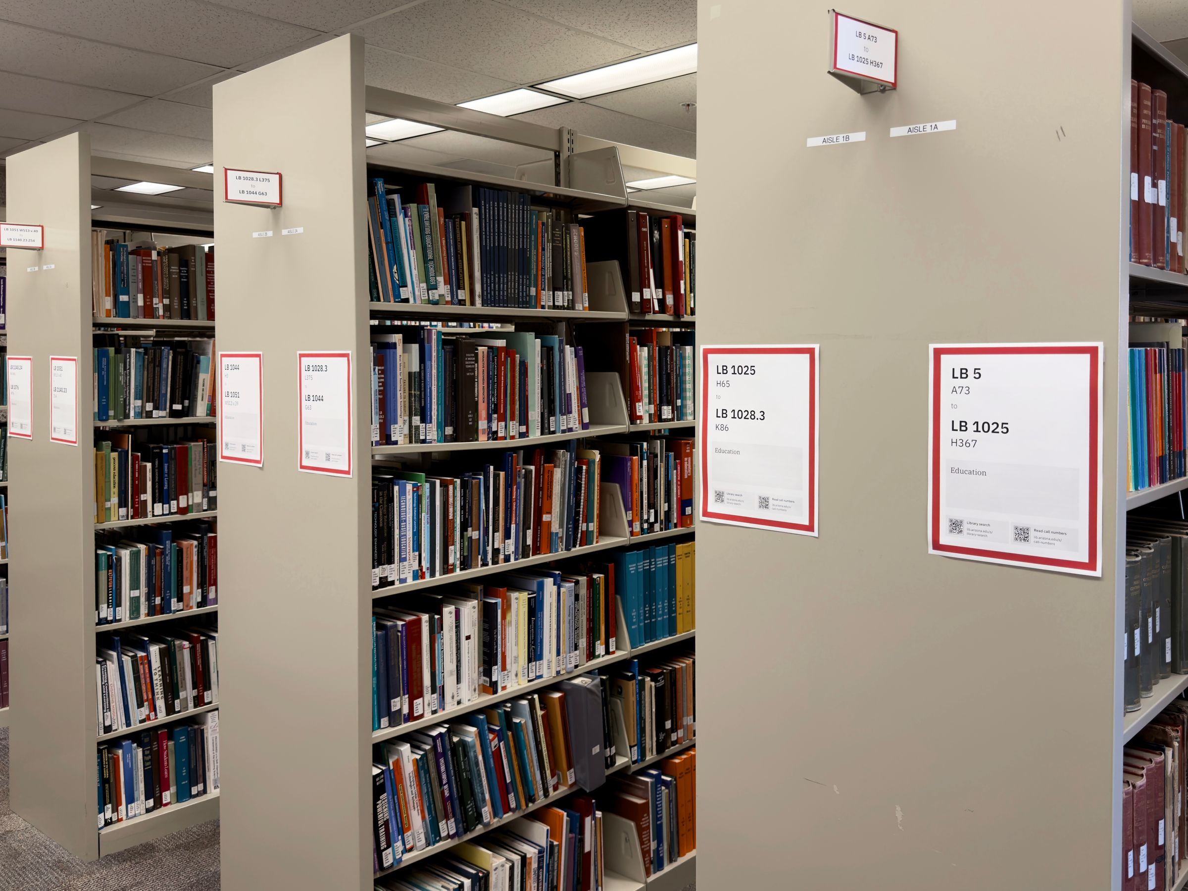
I created two types of signs. Both signs are installed on both ends of each stack (“stack-ends”):
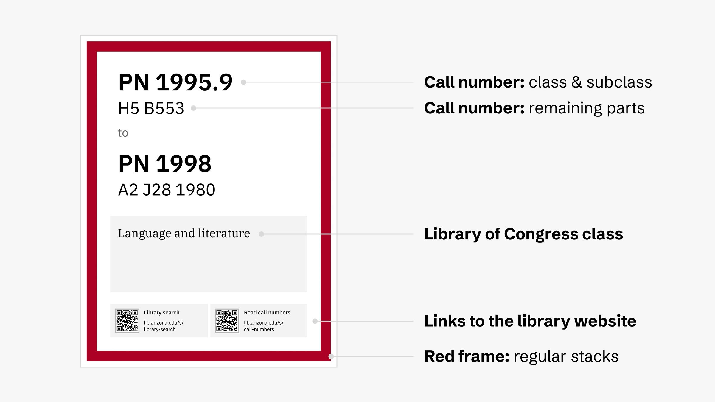
- Eye-level signs: printed on US letter-size papers (8.5 × 11 inch or 216 × 279mm) and installed at 48 inches or 1.2m for the lower edge.
- Flag signs: printed on index card papers (3 × 5 inches or 76 × 127mm) and inserted in the card holders near the top of the stack-end.
Editing & printing
The Print & Collaborative Collection Initiatives Unit team that manages the stacks has been editing existing signs in Microsoft Word and printing them using a black & white printer. To minimize disruptions to their day-to-day work and avoid introducing new tools, I created a new but familiar workflow for printing the signs.
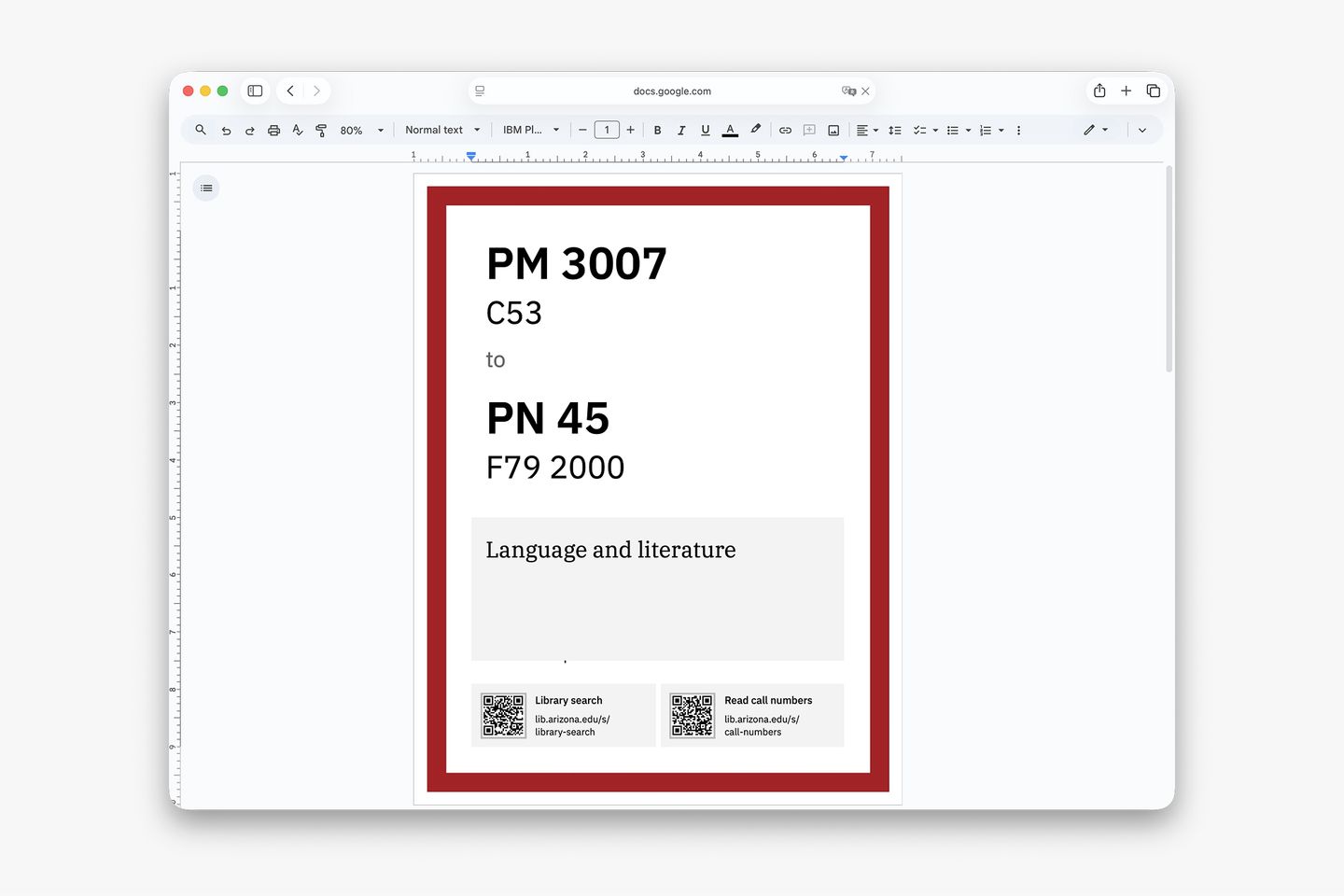
I created prototypes for the templates using Figma but finalized them in Google Docs. This allows Collection Services members to edit call numbers, subjects, and collection names in a tool they know well.
I created a two-step process for printing the signs. My team, the UX team at the library, have access to a color printer, so we batch-print the color frames. Then, we hand off to the Print & Collaborative Collection Initiatives team so they can layer the actual content on top of the frame using a black and white printer. This reduced the stress of adopting a new setup, and printing less with a color printer helped save cost.
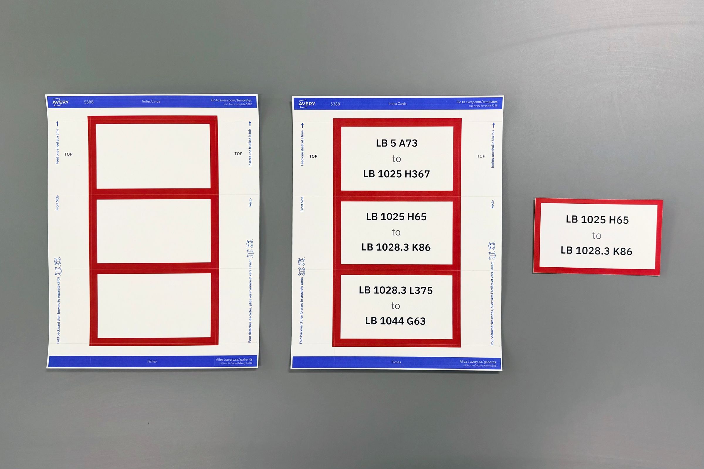

The flag signs are printed in groups of three using the Avery #5388 index card template. This template has perforated lines that makes separating easy.
Installing
I consulted with the university’s sign shop staff and learned about the accessibility requirements for the types of signs I designed. I learned that the eye-level sign needs to be installed at 48 inches or 1.2m for its lower edge. Also, to my surprise, the sign shop doesn’t have a fast and easy way to install the eye-level signs—they recommended using a measuring tape.
Since we need to install hundreds of signs during a collection shift, we need to find a way to speed up the process. I worked with Arshia Amin, our student assistant, to design a cost-efficient tool that serves as mounting guide. We combined a mailing tube that measures 48 inches long with a 3D-printed piece that sits on one end of the tool.
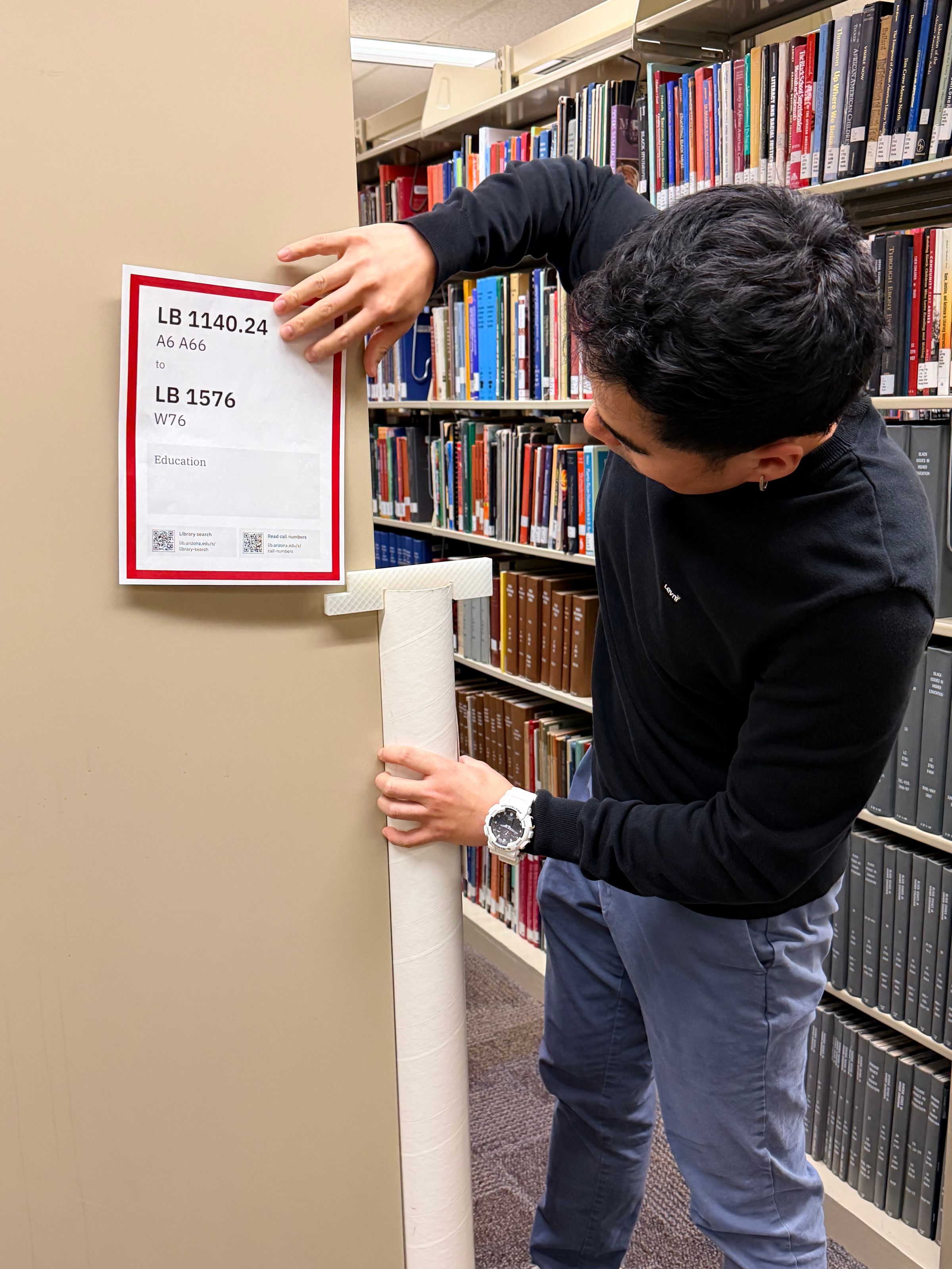
To install an eye-level sign, first put double-sided on all four corners of a printed sign. Then, line up the mailing tube with the edge of a stack-end. Finally, line up the sign with the corner on the 3D-printed piece, and press firmly to attach the sign.
Result
My role
Throughout this project, I:
- designed the signage templates using Figma and Google Docs
- created the printing workflow and documentation
- partnered with library staff to interview library users and staff
- partnered with library staff to test prototypes through usability testing
- partnered with UX Student Assistants to create the mounting guide tool
- partnered with UX Student Assistants to install signs for the pilot project